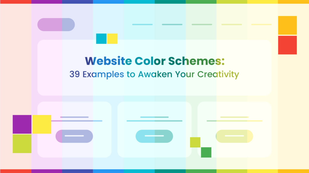
Exploring Color Harmony in Web Design: Creating Aesthetically Pleasing and Effective Interfaces
In the realm of web design, color harmony plays a pivotal role in shaping user experiences, establishing brand identities, and conveying messages effectively. The thoughtful selection and arrangement of colors can significantly impact the overall aesthetics and usability of a website. In this article, we delve into the concept of color harmony, exploring its importance, principles, and practical applications in web design.
Understanding Color Harmony
Color harmony refers to the pleasing arrangement of colors in a design that creates a sense of balance and unity. Achieving harmony involves selecting colors that complement each other and arranging them in a way that is visually appealing. By leveraging principles of color theory and design aesthetics, web designers can create cohesive and engaging user interfaces.
The Importance of Color Harmony in Web Design
In the digital landscape, where users are inundated with information and stimuli, color harmony serves as a powerful tool to capture attention, guide navigation, and evoke desired emotions. A harmonious color scheme can enhance usability, improve brand recognition, and foster positive perceptions of a website.
Principles of Color Harmony
Several principles govern the creation of color harmony in web design:
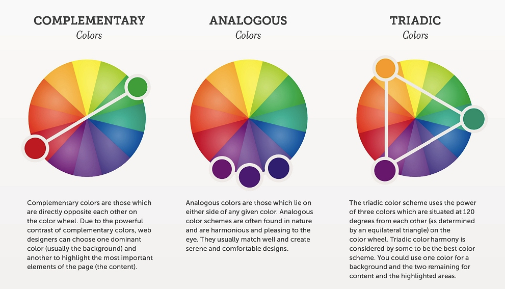
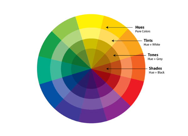
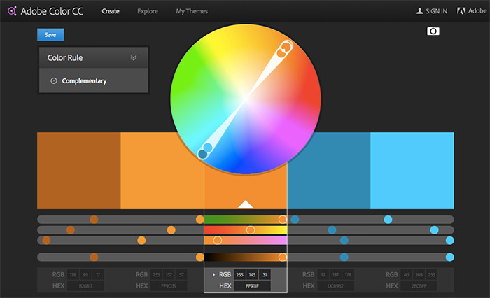
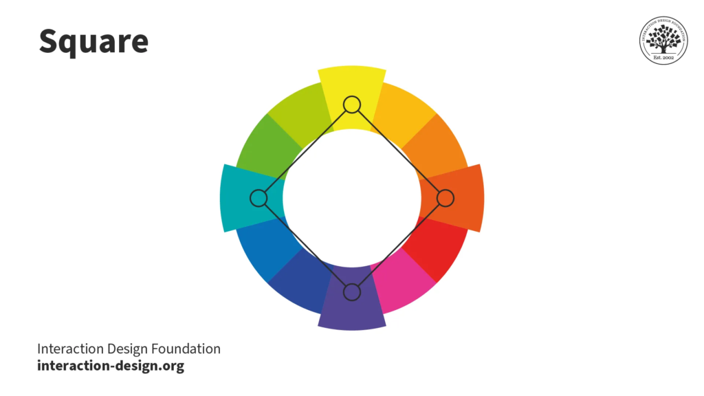
- Color Relationships: Understanding the relationships between colors is fundamental to achieving harmony. This includes concepts such as complementary, analogous, and triadic color schemes, which dictate how colors interact with each other on the color wheel.
- Balance: Balancing colors involves distributing them evenly throughout the design to create visual equilibrium. This can be achieved through careful consideration of color intensity, saturation, and placement.
- Contrast: Contrast is essential for creating visual interest and hierarchy within a design. By juxtaposing light and dark colors or warm and cool tones, designers can draw attention to key elements and improve readability.
- Consistency: Consistency in color usage across different pages and elements of a website fosters coherence and reinforces branding. Establishing a consistent color palette and style guide ensures a cohesive user experience.
- Emotional Resonance: Colors have the power to evoke emotions and associations. Designers should consider the psychological effects of colors and select hues that align with the intended mood or message of the website.
Practical Applications in Web Design
Implementing color harmony principles in web design involves a series of strategic decisions:
- Brand Identity: Color plays a central role in brand identity, with many companies incorporating their brand colors into their website design. Consistency between offline and online branding reinforces brand recognition and fosters trust.
- User Interface Design: In user interface design, color is used to differentiate elements, indicate interactivity, and create visual hierarchy. By employing contrasting colors for call-to-action buttons and using subtle gradients for depth, designers can enhance usability and navigation.
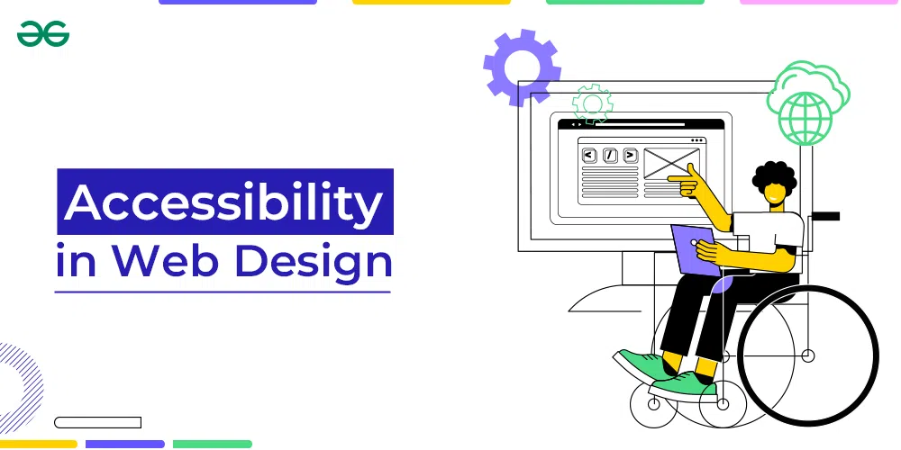
- Accessibility: Accessibility considerations are paramount in web design, and color plays a crucial role in ensuring that websites are usable by individuals with visual impairments. Designers should strive to maintain sufficient color contrast and provide alternative text for color-coded information.
- Responsive Design: When designing for different devices and screen sizes, color can help maintain consistency and readability across various contexts. Adaptable color schemes that adjust based on screen resolution and device capabilities contribute to a seamless user experience.
Conclusion
Color harmony is a fundamental aspect of web design that influences user perceptions, interactions, and brand associations. By understanding the principles of color theory and applying them thoughtfully, designers can create visually captivating and functionally effective websites. Whether crafting brand identities, designing user interfaces, or enhancing accessibility, color harmony remains an indispensable tool for shaping digital experiences in the ever-evolving landscape of web design.