
Color Scheme
The Basics of Color Schemes for Web Design
The Basics of Color Schemes for Web Design: Enhancing User Experience Through Visual Harmony In

The Basics of Color Schemes for Web Design: Enhancing User Experience Through Visual Harmony In

Cultural and Contextual Considerations for Web Design In the interconnected global landscape of the internet,
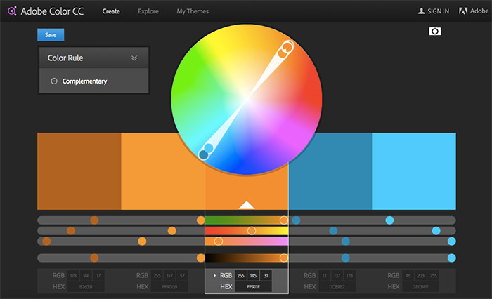
Exploring Color Tools for Web Design: Enhancing Creativity and Efficiency In the realm of web

Accessibility in Web Design: Empowering Inclusivity and Usability In today’s digital age, the internet serves
Exploring Color Harmony in Web Design: Creating Aesthetically Pleasing and Effective Interfaces In the realm
Understanding Color Psychology in Web Design In the realm of web design, color is far
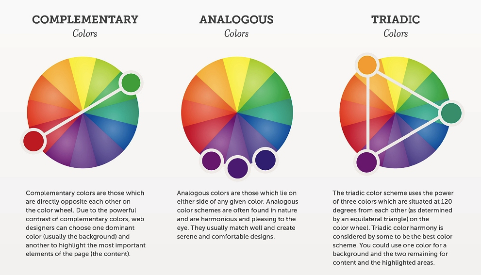
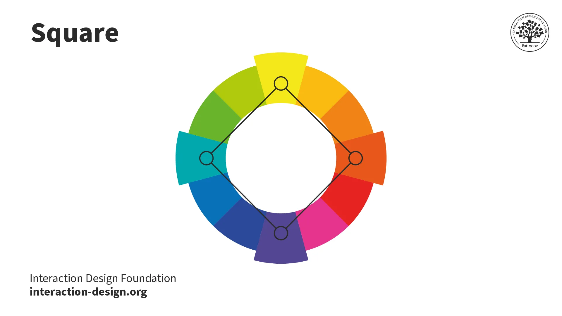
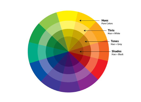
Exploring Types of Color Schemes for Web Design Color plays a crucial role in web

Mastering Color Schemes in Web Design: Crafting Engaging Digital Experiences Introduction:Color is a fundamental element