
The Basics of Color Schemes for Web Design: Enhancing User Experience Through Visual Harmony
In the realm of web design, color plays a pivotal role in shaping user experiences, influencing perceptions, and communicating brand messages effectively. A well-crafted color scheme can captivate visitors, guide them through content, and evoke desired emotions. Understanding the fundamentals of color schemes is essential for web designers to create visually appealing and cohesive websites. In this comprehensive guide, we delve into the basics of color schemes for web design, exploring various concepts, principles, and best practices.
Introduction to Color Theory
At the core of understanding color schemes lies the foundation of color theory. Color theory is a set of principles and guidelines that elucidate how colors interact with each other and the human eye. By familiarizing oneself with color theory, designers gain insights into creating harmonious and aesthetically pleasing color combinations.
Basic Color Theory
Color theory encompasses a multitude of definitions, concepts and design applications – enough to fill several encyclopedias. However, there are three basic categories of color theory that are logical and useful : The color wheel, color harmony, and the context of how colors are used.
Color theories create a logical structure for color. For example, if we have an assortment of fruits and vegetables, we can organize them by color and place them on a circle that shows the colors in relation to each other.
The Color Wheel
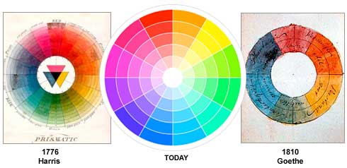
A color circle, based on red, yellow and blue, is traditional in the field of art. Sir Isaac Newton developed the first circular diagram of colors in 1666. Since then, scientists and artists have studied and designed numerous variations of this concept. Differences of opinion about the validity of one format over another continue to provoke debate. In reality, any color circle or color wheel which presents a logically arranged sequence of pure hues has merit.
There are also definitions (or categories) of colors based on the color wheel. We begin with a 3-part color wheel.
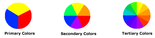
Primary Colors: Red, yellow and blue
In traditional color theory (used in paint and pigments), primary colors are the 3 pigment colors that cannot be mixed or formed by any combination of other colors. All other colors are derived from these 3 hues.
Secondary Colors: Green, orange and purple
These are the colors formed by mixing the primary colors.
Tertiary Colors: Yellow-orange, red-orange, red-purple, blue-purple, blue-green & yellow-green
These are the colors formed by mixing a primary and a secondary color. That’s why the hue is a two word name, such as blue-green, red-violet, and yellow-orange.
Color Harmony
Harmony can be defined as a pleasing arrangement of parts, whether it be music, poetry, color, or even an ice cream sundae.
In visual experiences, harmony is something that is pleasing to the eye. It engages the viewer and it creates an inner sense of order, a balance in the visual experience. When something is not harmonious, it’s either boring or chaotic. At one extreme is a visual experience that is so bland that the viewer is not engaged. The human brain will reject under-stimulating information. At the other extreme is a visual experience that is so overdone, so chaotic that the viewer can’t stand to look at it. The human brain rejects what it cannot organize, what it cannot understand. The visual task requires that we present a logical structure. Color harmony delivers visual interest and a sense of order.
In summary, extreme unity leads to under-stimulation, extreme complexity leads to over-stimulation. Harmony is a dynamic equilibrium.
Some Formulas for Color Harmony
There are many theories for harmony. The following illustrations and descriptions present some basic formulas.
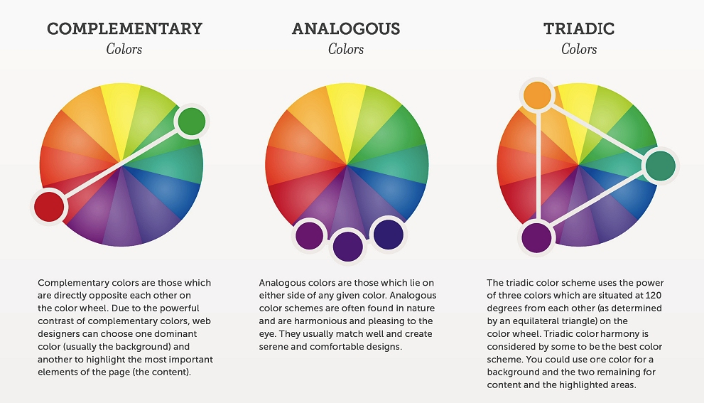
1. A color scheme based on analogous colors

Analogous colors are any three colors which are side by side on a 12-part color wheel, such as yellow-green, yellow, and yellow-orange. Usually one of the three colors predominates.
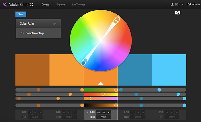
2. A color scheme based on complementary colors

Complementary colors are any two colors which are directly opposite each other, such as red and green and red-purple and yellow-green. In the illustration above, there are several variations of yellow-green in the leaves and several variations of red-purple in the orchid. These opposing colors create maximum contrast and maximum stability.
3. A color scheme based on nature

Nature provides a perfect departure point for color harmony. In the illustration above, red yellow and green create a harmonious design, regardless of whether this combination fits into a technical formula for color harmony.
Components of Color
Before delving into color schemes, it’s imperative to grasp the components of color:
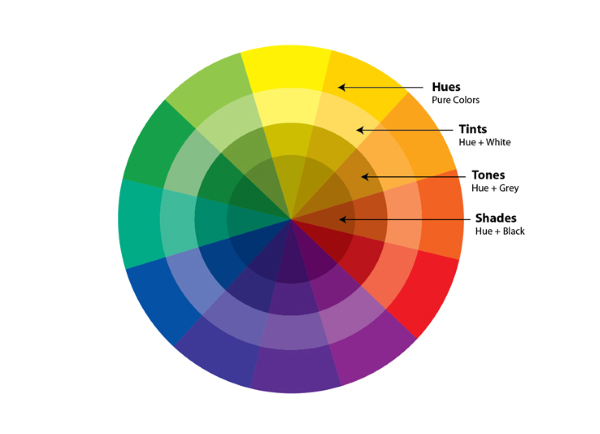
- Hue: The pure spectrum colors, such as red, blue, and green.
- Saturation: The intensity or purity of a color. Higher saturation results in more vibrant hues, while lower saturation leads to muted tones.
- Value: The lightness or darkness of a color. Adjusting the value can create contrasts and depth within a color scheme.
Types of Color Schemes
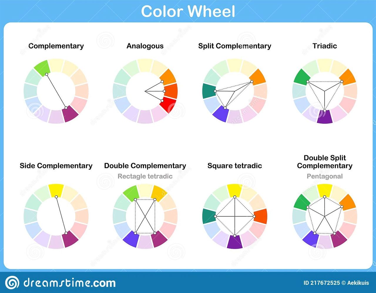
Understanding the different types of color schemes empowers designers to select the most suitable palette for their web projects. Some common color schemes include:
- Monochromatic: Utilizes variations of a single hue, offering a cohesive and understated aesthetic.
- Analogous: Incorporates colors adjacent to each other on the color wheel, fostering a sense of harmony and continuity.
- Complementary: Combines colors situated opposite each other on the color wheel, creating dynamic contrast and visual impact.
- Triadic: Involves three colors evenly spaced around the color wheel, achieving balance and vibrancy.
- Split-Complementary: Similar to complementary, but uses adjacent colors to one of the complementary hues, offering a nuanced approach to contrast.
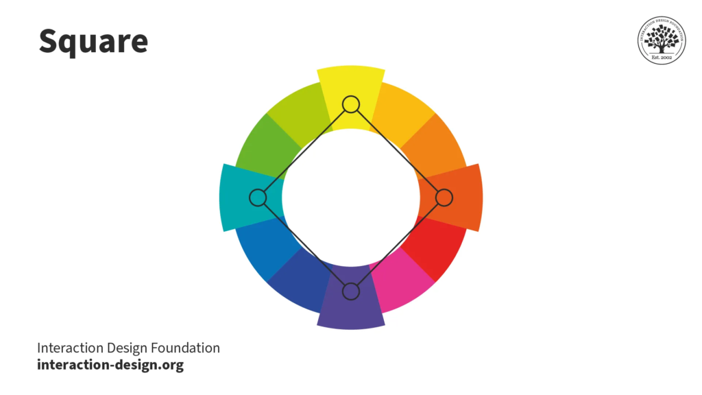
- Tetradic: Employs two sets of complementary colors, providing versatility and richness in color combinations.
- Neutral: Integrates neutral tones such as black, white, gray, or beige to balance and complement other colors in the scheme.
Color Psychology in Web Design
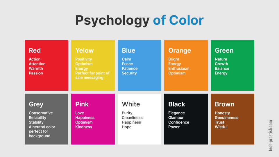
Beyond aesthetics, colors possess psychological attributes that can influence user behavior and perception. By harnessing the principles of color psychology, designers can evoke specific emotions and responses from website visitors. For instance:
- Red: Often associated with passion, energy, and urgency. It can be used to grab attention or convey excitement.
- Blue: Symbolizes trust, tranquility, and professionalism. It’s commonly employed in corporate and financial websites.
- Yellow: Radiates warmth, optimism, and cheerfulness. It can evoke feelings of happiness and positivity.
- Green: Represents growth, harmony, and nature. It’s suitable for eco-friendly or health-related websites.
Achieving Color Harmony
Harmony is key to a successful color scheme, ensuring that colors complement each other and contribute to a unified visual experience. Designers can achieve harmony through:
- Balancing Contrast: Maintaining a balance between light and dark tones to enhance readability and visual hierarchy.
- Consistency: Using consistent color schemes across different pages and elements to establish coherence and reinforce branding.
- Emphasis: Employing contrasting colors or accents strategically to draw attention to important elements, such as calls-to-action.
Accessibility and Color Contrast
Accessibility is a critical consideration in web design, and color plays a significant role in ensuring inclusivity for all users. Designers should adhere to accessibility standards, such as the Web Content Accessibility Guidelines (WCAG), to ensure sufficient color contrast for readability. Tools and resources are available to evaluate color combinations and ensure compliance with accessibility guidelines.
Cultural and Contextual Considerations
Colors can carry different meanings and cultural associations across diverse audiences and contexts. Designers should be mindful of cultural sensitivities and preferences when selecting color schemes, especially for global or multicultural audiences. Conducting research and soliciting feedback from target demographics can help designers make informed color choices.
Tools and Resources for Color Selection
Numerous tools and resources are available to assist designers in selecting and refining color schemes for web projects. From color palette generators to accessibility checkers, these tools streamline the color selection process and facilitate collaboration among design teams.
Conclusion
In conclusion, mastering the basics of color schemes is essential for web designers seeking to create captivating and user-centric websites. By understanding color theory, exploring different types of color schemes, leveraging color psychology, and prioritizing accessibility, designers can craft visually stunning and engaging web experiences that resonate with audiences worldwide. With careful consideration and creativity, color becomes a powerful tool for enhancing user experience and driving the success of web design endeavors.