Exploring Types of Color Schemes for Web Design
Color plays a crucial role in web design, influencing not only the aesthetic appeal but also the user experience and brand identity. Choosing the right color scheme can significantly impact how visitors perceive and interact with a website. By understanding different types of color schemes and their applications, web designers can create visually appealing and effective online experiences. In this article, we’ll delve into various types of color schemes commonly used in web design, exploring their characteristics, benefits, and best practices.
1. Monochromatic Color Scheme
A monochromatic color scheme revolves around a single base color, with variations in saturation and brightness. This type of scheme creates a harmonious and unified look, making it suitable for minimalist designs or when aiming for a subtle, sophisticated aesthetic. By using different shades and tints of the same hue, designers can achieve visual interest without overwhelming the viewer. Monochromatic schemes are versatile and well-suited for conveying a sense of elegance and simplicity.
Benefits:
- Creates a cohesive and unified visual experience.
- Offers simplicity and elegance.
- Easy to implement and maintain consistency.
- Ideal for minimalist and modern designs.
Best Practices:
- Experiment with different shades and tints of the base color.
- Introduce subtle variations in saturation and brightness for visual depth.
- Use contrast strategically to highlight key elements.
2. Analogous Color Scheme
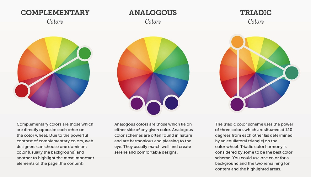
An analogous color scheme consists of colors that are adjacent to each other on the color wheel. This type of scheme creates a sense of harmony and cohesion, making it effective for conveying a unified theme or mood. Analogous schemes often evoke natural and soothing associations, making them suitable for websites related to health, wellness, or nature. Designers can explore variations within the chosen color range to add visual interest while maintaining consistency.
Benefits:
- Provides a cohesive and harmonious color palette.
- Evokes a natural and soothing aesthetic.
- Allows for subtle variations while maintaining unity.
- Well-suited for conveying a specific theme or mood.
Best Practices:
- Choose colors that are close to each other on the color wheel.
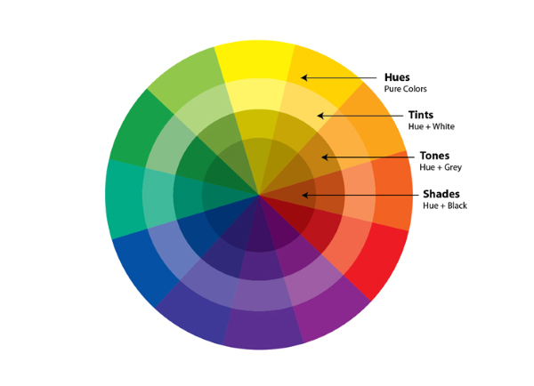
- Experiment with different shades, tints, and tones within the analogous range.
- Use one dominant color and accent with others for emphasis.
3. Complementary Color Scheme
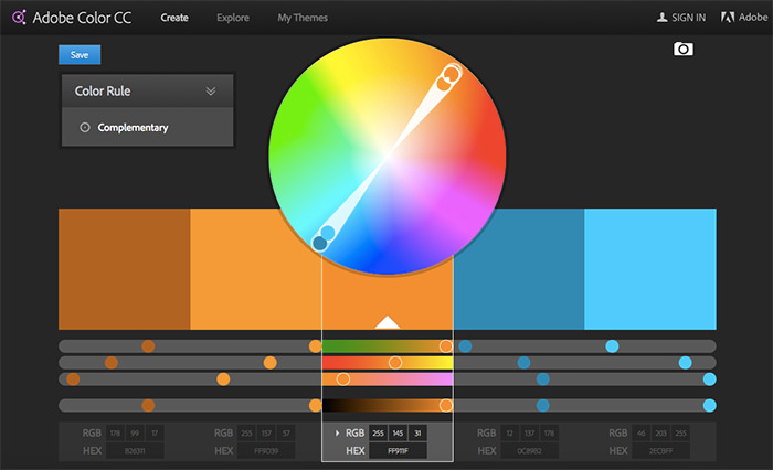
A complementary color scheme involves colors that are opposite each other on the color wheel. This type of scheme creates high contrast and vibrancy, making it effective for grabbing attention and creating visual impact. Complementary schemes often feature a primary color paired with its direct complement, creating a dynamic and energetic palette. However, using complementary colors in large doses can be overwhelming, so designers should use them strategically to avoid visual fatigue.
Benefits:
- Offers strong contrast and visual impact.
- Creates a vibrant and dynamic aesthetic.
- Draws attention to key elements.
- Provides versatility for various design styles.
Best Practices:
- Use complementary colors sparingly to avoid overwhelming the viewer.
- Balance the intensity of complementary hues for visual harmony.
- Incorporate neutrals or muted tones to temper the contrast.
4. Triadic Color Scheme
A triadic color scheme involves three colors that are evenly spaced around the color wheel, forming an equilateral triangle. This type of scheme offers a balance between contrast and harmony, making it versatile and visually appealing. Triadic schemes provide opportunities for creativity and dynamism while maintaining overall coherence. Designers can experiment with different combinations of primary, secondary, or tertiary colors to achieve various effects.
Benefits:
- Offers balance between contrast and harmony.
- Provides versatility and flexibility.
- Allows for creative and dynamic color combinations.
- Creates visually engaging designs.
Best Practices:
- Choose colors that are evenly spaced on the color wheel.
- Experiment with different triadic combinations to find the right balance.
- Use one dominant color and accent with others for emphasis.
5. Split-Complementary Color Scheme
A split-complementary color scheme is similar to a complementary scheme but uses a base color paired with the two colors adjacent to its complement. This type of scheme offers the contrast of complementary colors while reducing the potential for visual overload. Split-complementary schemes provide a balanced and visually appealing palette, making them suitable for a wide range of design applications.
Benefits:
- Offers strong contrast without the intensity of complementary schemes.
- Creates a balanced and visually pleasing palette.
- Provides flexibility for experimentation.
- Allows for the incorporation of both warm and cool tones.
Best Practices:
- Choose a dominant base color and pair it with its split complements.
- Experiment with different variations to achieve the desired balance.
- Use one color as the focal point and accent with others as needed.
Conclusion
In web design, color schemes play a crucial role in shaping the overall look and feel of a website. By understanding the characteristics and applications of different types of color schemes, designers can create visually compelling and effective online experiences. Whether aiming for harmony and cohesion or contrast and impact, choosing the right color scheme is essential for conveying the desired message and engaging the audience effectively. By leveraging the versatility and creative potential of various color schemes, web designers can elevate their designs and create memorable user experiences.

