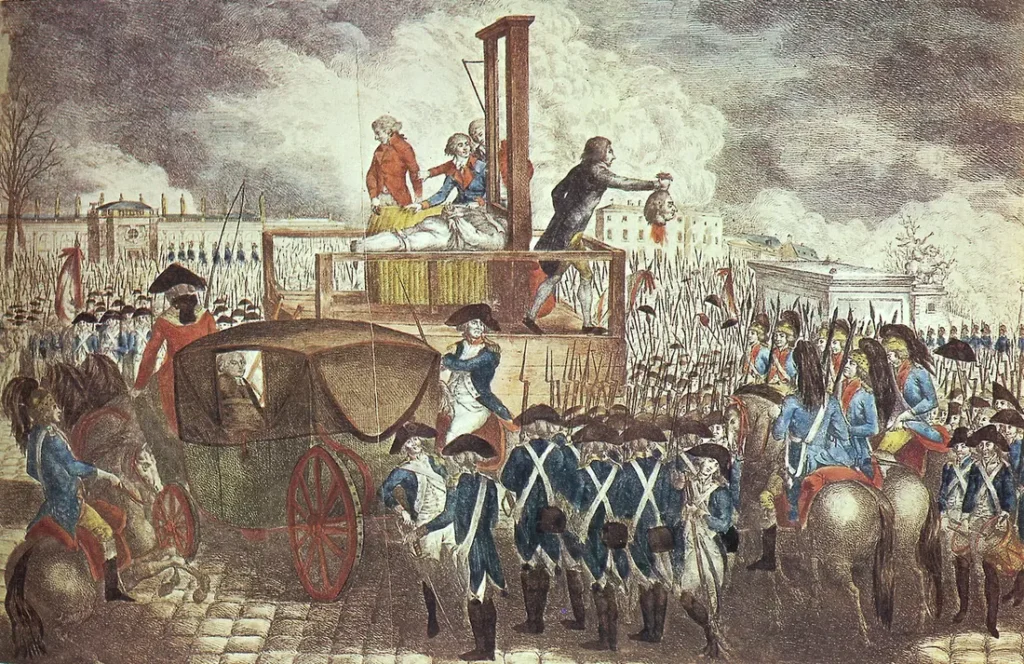
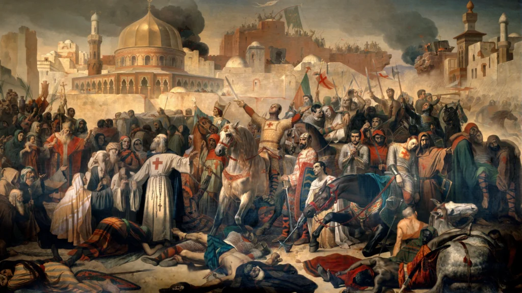
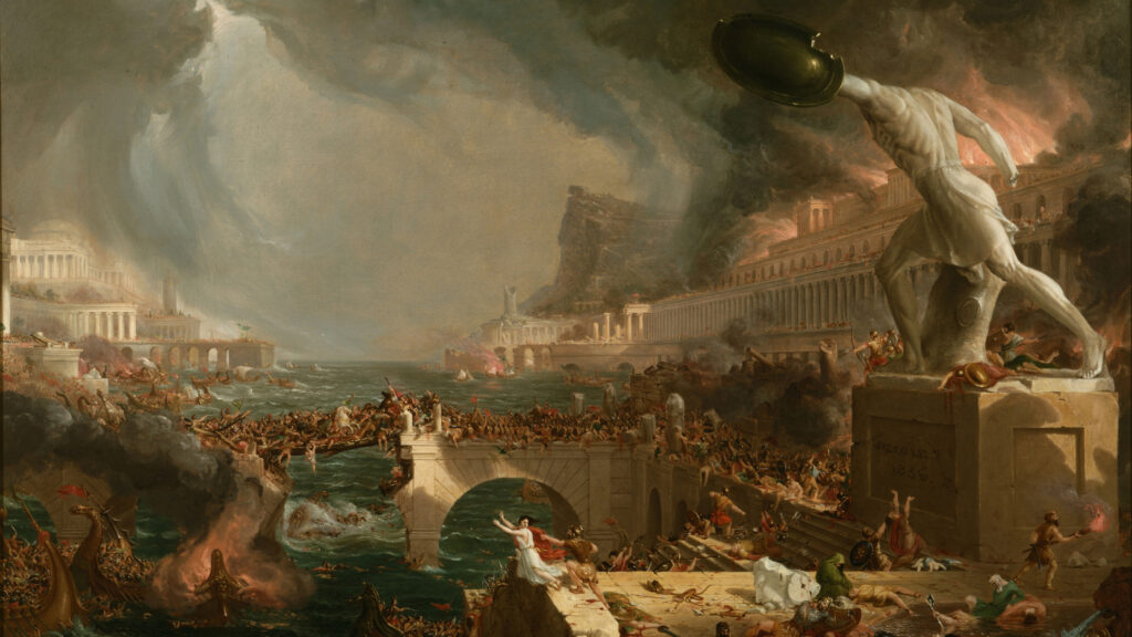
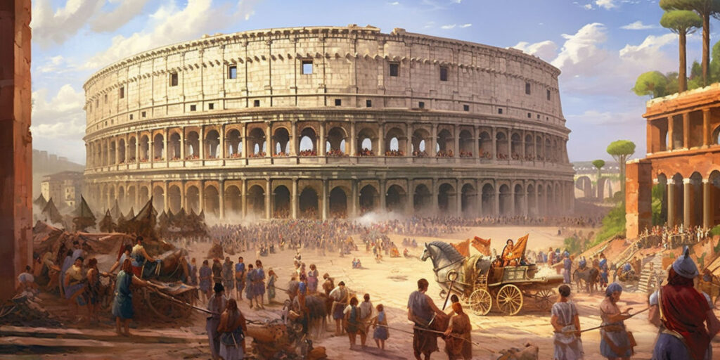
The Roman Empire: A Comprehensive Overview Introduction The Roman Empire, one of history’s most influential civilizations, dominated much of Europe, North Africa, and the Middle East for centuries. From its legendary founding in 753 BCE to its fall in 476 CE, the Roman Empire left an indelible mark on law, government, architecture, engineering, and culture. This article provides a detailed exploration of the Roman Empire, covering its geography, history, culture, and enduring legacy. The Geography of the Roman Empire The Italian Peninsula The Roman Empire originated on the Italian Peninsula, a region with diverse geography including mountains, plains, and a lengthy coastline. The fertile plains of the Po and Tiber River valleys supported agriculture, while the Apennine Mountains provided natural defenses and resources. Expansion Across Three Continents At its height, the Roman Empire encompassed territories across Europe, Asia, and Africa. Key regions included the Italian heartland, the provinces of Gaul (modern France), Hispania (modern Spain), Britannia (modern UK), and the rich lands of Egypt and North Africa. This vast expanse facilitated trade, cultural exchange, and military conquest. The Founding and Early Republic The Mythical Founding According to legend, Rome was founded in 753 BCE by Romulus and Remus, twin brothers raised by a she-wolf. Romulus later killed Remus and became the first king of Rome. While mythical, this story reflects Rome’s perceived origins and values of strength and resilience. The Roman Republic Around 509 BCE, the Roman Republic was established, replacing the monarchy. The Republic was characterized by a complex system of checks and balances, with power divided among the Senate, elected magistrates, and popular assemblies. Key offices included the Consuls, who acted as chief executives, and the Senate, which wielded significant influence over policy and finance. The Expansion of Rome The Punic Wars Rome’s expansion was marked by the Punic Wars (264-146 BCE), a series of conflicts with the Carthaginian Empire. The most famous Carthaginian general, Hannibal, posed a significant threat to Rome, but the Romans ultimately prevailed. The destruction of Carthage in 146 BCE solidified Rome’s dominance in the western Mediterranean. Conquests and Provinces Rome continued to expand through military conquests and alliances. Notable conquests included Greece, Gaul (led by Julius Caesar), Egypt, and parts of the Middle East. These territories were organized into provinces governed by Roman officials, which facilitated control and integration into the empire. The Transition from Republic to Empire Julius Caesar and the End of the Republic Julius Caesar’s rise to power marked the end of the Roman Republic. His military successes, political reforms, and eventual appointment as dictator for life alarmed many senators, leading to his assassination in 44 BCE. This event plunged Rome into a series of civil wars. Augustus and the Birth of the Empire Caesar’s adopted heir, Octavian (later Augustus), emerged victorious from the civil wars. In 27 BCE, the Senate granted him the title of Augustus, effectively marking the beginning of the Roman Empire. Augustus implemented significant reforms, stabilized the empire, and ushered in the Pax Romana, a period of relative peace and prosperity. The Golden Age of the Roman Empire The Julio-Claudian and Flavian Dynasties The early Roman Empire saw the reign of the Julio-Claudian dynasty, including emperors such as Tiberius, Caligula, Claudius, and Nero. Despite periods of instability and tyranny, this era also witnessed significant administrative and architectural achievements. The Flavian dynasty, which followed, included emperors Vespasian, Titus, and Domitian. They restored stability after the turmoil of Nero’s reign and the Year of the Four Emperors (69 CE). The construction of the Colosseum, an iconic symbol of Roman engineering and culture, began under Vespasian and was completed by Titus. The Five Good Emperors The period from 96 to 180 CE, known as the reign of the “Five Good Emperors” (Nerva, Trajan, Hadrian, Antoninus Pius, and Marcus Aurelius), is considered a high point of the Roman Empire. These emperors were known for their effective governance, military successes, and contributions to infrastructure and culture. Roman Law and Governance Roman law was a cornerstone of the empire’s stability and governance. The development of the Twelve Tables and subsequent legal codes provided a framework for justice and administration. The principle of “innocent until proven guilty” and other legal concepts have influenced modern legal systems. Daily Life and Culture Social Structure Roman society was hierarchical, with a distinct class system. The patricians (aristocratic families) and plebeians (common citizens) were the main classes, with slaves and freedmen forming the lower echelons. Social mobility was possible through military service, wealth accumulation, or manumission (the freeing of slaves). Family and Education The Roman family, or familia, was patriarchal, with the paterfamilias (male head of the household) wielding considerable authority. Education was highly valued, particularly for the upper classes. Boys were taught rhetoric, philosophy, and law, while girls were educated in domestic skills and, in some cases, literature and the arts. Religion and Mythology Roman religion was polytheistic, with a pantheon of gods and goddesses similar to those of ancient Greece. Key deities included Jupiter (king of the gods), Juno (his wife), Mars (god of war), and Venus (goddess of love). Religious rituals, festivals, and temples played a central role in public and private life. Roman Engineering and Architecture Roads and Aqueducts Roman engineering achievements were remarkable. The extensive network of roads, famously straight and durable, facilitated military movements, trade, and communication. Aqueducts, such as the Pont du Gard in France, provided cities with fresh water and exemplified Roman engineering prowess. Public Buildings and Monuments Roman architecture included grand public buildings and monuments. The Colosseum, used for gladiatorial games and public spectacles, and the Pantheon, with its impressive dome and oculus, are enduring symbols of Roman architectural innovation. The use of concrete allowed for the construction of durable and expansive structures. The Decline and Fall of the Roman Empire Economic and Political Instability The decline of the Roman Empire was marked by economic troubles, political instability, and military challenges. High taxes, inflation, and reliance on slave labor weakened the economy. Corruption and power struggles undermined
