Responsive Layouts: Crafting Adaptive Web Experiences
In the dynamic world of web design, where users access websites on an array of devices ranging from desktop computers to smartphones and tablets, responsive layouts have emerged as a quintessential tool for crafting adaptable and user-friendly experiences. Responsive web design is not merely a trend; it’s a fundamental approach to ensure that websites look and function seamlessly across various screen sizes and resolutions. In this comprehensive guide, we delve into the intricacies of responsive layouts, exploring their importance, principles, implementation techniques, and best practices.
1. Understanding Responsive Layouts
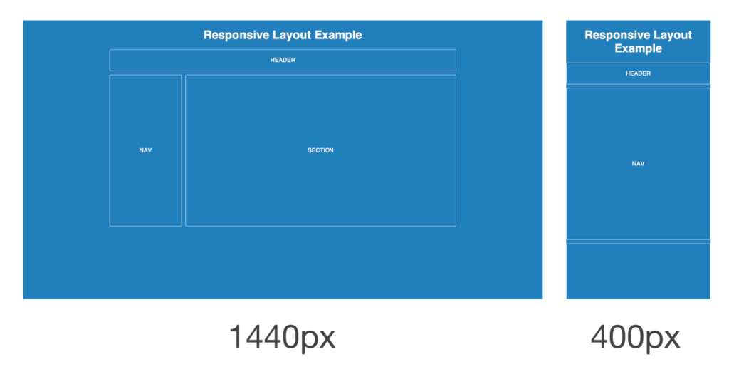
Responsive layouts refer to the design approach where web content dynamically adjusts and reflows to fit different screen sizes and orientations. The primary goal of responsive design is to provide an optimal viewing experience, ensuring that users can easily navigate and interact with a website regardless of the device they’re using. Whether it’s a widescreen desktop monitor, a compact smartphone, or a tablet held in portrait mode, responsive layouts adapt intelligently to accommodate the available screen real estate.
2. The Importance of Responsive Design
In today’s multi-device landscape, the need for responsive design cannot be overstated. With the proliferation of smartphones and tablets, users expect websites to be accessible and functional on any device they choose. Failure to provide a responsive experience can lead to frustrated users, increased bounce rates, and ultimately, loss of potential customers. Moreover, search engines like Google prioritize mobile-friendly websites in their rankings, making responsiveness crucial for SEO (Search Engine Optimization) and overall visibility.
3. Principles of Responsive Layouts
Achieving effective responsive layouts requires adherence to several key principles:
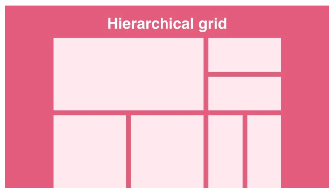
- Fluid Grids: Instead of fixed-width layouts, responsive designs utilize fluid grids that proportionally scale with the viewport size. This ensures that elements maintain their relative proportions across different screen sizes.
- Flexible Images and Media: Images and media assets should also adapt fluidly to the viewport size. Techniques such as setting maximum width to 100% and using scalable vector graphics (SVGs) help ensure that visuals remain crisp and legible on any device.
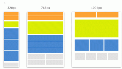
- Media Queries: Media queries are CSS rules that enable designers to apply different styles based on the characteristics of the device, such as screen width, height, and orientation. By using media queries, designers can create breakpoints where the layout adjusts to accommodate various screen sizes.
4. Implementation Techniques
Implementing responsive layouts involves a combination of HTML, CSS, and sometimes JavaScript. Here are some common techniques:
- Viewport Meta Tag: Including the viewport meta tag in the HTML head ensures that the browser renders the page according to the device’s screen size, preventing content from appearing zoomed out or cropped.
- Fluid Layouts with CSS Grid or Flexbox: CSS Grid and Flexbox provide powerful tools for creating fluid layouts that adapt to different screen sizes. These layout systems offer precise control over the positioning and alignment of elements.
- Media Queries: Writing media queries in CSS allows designers to define specific styles for different viewport sizes. By setting breakpoints at key screen widths, designers can optimize the layout for various devices.
5. Best Practices for Responsive Design
- Mobile-First Approach: Start by designing for mobile devices and progressively enhance the layout for larger screens. This ensures a solid foundation for the smallest viewports and prevents the need for extensive rework later.
- Performance Optimization: Responsive design should not come at the expense of performance. Optimize images, minify CSS and JavaScript, and leverage techniques like lazy loading to ensure fast loading times across all devices.
- User Testing and Iteration: Conduct usability testing on different devices to identify any usability issues or inconsistencies. Iterate on the design based on user feedback to continually improve the responsive experience.
6. Conclusion
In an era defined by digital ubiquity, responsive layouts have become a cornerstone of modern web design. By embracing the principles of flexibility, adaptability, and user-centricity, designers can create compelling web experiences that seamlessly transition across devices. As technology continues to evolve and new devices emerge, the importance of responsive design will only grow, making it essential for designers to stay abreast of best practices and emerging trends. With responsive layouts as their guiding principle, designers can ensure that websites remain accessible, engaging, and relevant in an ever-changing digital landscape.


