Exploring Fixed Layouts in Web Design: A Comprehensive Guide
In the realm of web design, the layout serves as the backbone upon which the entire user experience is built. One of the foundational layout types is the fixed layout. Fixed layouts, also known as static layouts, provide a stable and consistent structure for organizing content on webpages. In this comprehensive guide, we’ll delve deep into the nuances of fixed layouts, exploring their characteristics, benefits, drawbacks, and best practices in modern web design.
Understanding Fixed Layouts
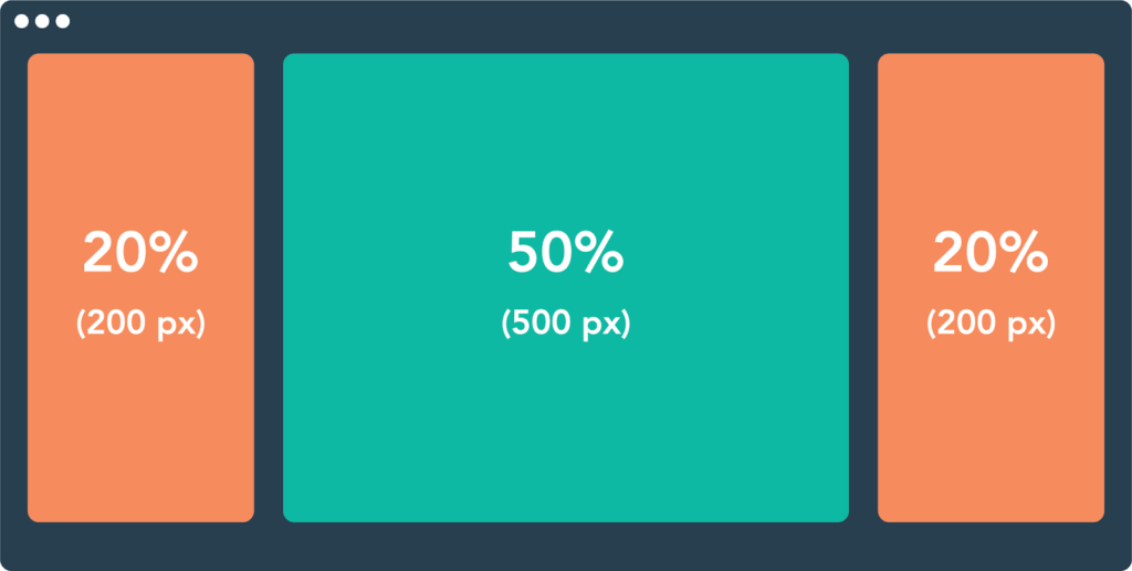
At its core, a fixed layout positions webpage elements at specific pixel widths, maintaining their exact placement regardless of the screen size or resolution. This means that content appears fixed in its position, creating a consistent visual presentation across different devices.
Characteristics of Fixed Layouts
- Pixel-Based Precision: Fixed layouts offer precise control over the positioning of elements on the webpage, as they are defined in pixels. Designers can meticulously craft the layout to achieve their desired aesthetic without worrying about elements shifting unpredictably.
- Consistency: With fixed layouts, the placement of content remains uniform across devices. This consistency is particularly advantageous for websites where maintaining a standardized appearance is crucial for branding and user experience.
- Design Stability: Elements within a fixed layout do not change in size or position based on screen dimensions or user interactions. This stability can be advantageous for certain types of content, such as advertisements or forms, where maintaining a fixed design is essential.
Benefits of Fixed Layouts
- Controlled Design: Fixed layouts empower designers to exert precise control over the visual presentation of their websites. This level of control is invaluable for ensuring that the design aligns with branding guidelines and communicates the desired message effectively.
- Predictable User Experience: Since content remains fixed in position, users can navigate the website with confidence, knowing that elements will not unexpectedly shift or resize. This predictability enhances the overall user experience and fosters trust and familiarity with the website.
- Optimized for Certain Content Types: Fixed layouts are well-suited for certain types of content, such as image galleries, advertisements, and landing pages, where maintaining a consistent design is paramount.
Challenges and Drawbacks
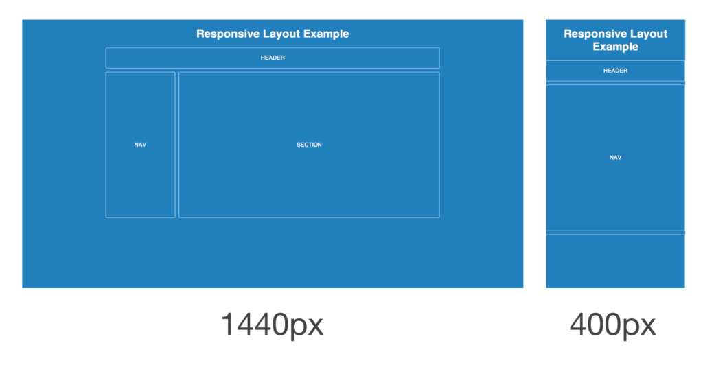
- Limited Flexibility: One of the primary drawbacks of fixed layouts is their lack of adaptability to different screen sizes and resolutions. Websites designed with fixed layouts may appear distorted or require horizontal scrolling on devices with smaller screens, such as smartphones and tablets.
- Accessibility Concerns: Fixed layouts can pose challenges for users with disabilities or those using assistive technologies. Elements positioned using fixed measurements may not scale appropriately, potentially hindering accessibility for individuals with visual impairments.
- Cross-Device Compatibility: In an era where users access websites from a multitude of devices, ensuring cross-device compatibility is paramount. Fixed layouts may struggle to provide an optimal viewing experience across diverse screen sizes and orientations.
Best Practices for Implementing Fixed Layouts
- Set Maximum Width: To mitigate issues related to large screens, consider setting a maximum width for the fixed layout. This ensures that content remains centered and readable, even on widescreen displays.
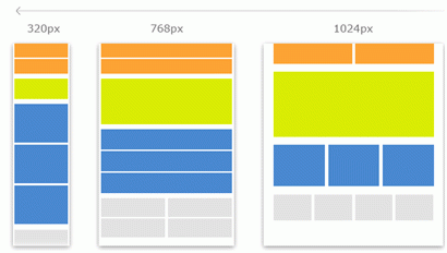
- Use Media Queries Responsibly: While fixed layouts do not inherently adapt to different screen sizes, you can enhance their responsiveness using CSS media queries. Implement breakpoints to adjust the layout for smaller screens, maintaining readability and usability across devices.
- Prioritize Mobile Optimization: Recognize the importance of mobile optimization in today’s digital landscape. While fixed layouts may not be inherently mobile-friendly, implementing responsive design principles can ensure a seamless experience for users on smartphones and tablets.
- Test Across Devices: Thoroughly test the fixed layout across various devices and screen sizes to identify any compatibility issues or layout inconsistencies. Utilize browser developer tools and device emulators to simulate different viewing environments and optimize the design accordingly.
Conclusion
Fixed layouts have long been a staple of web design, offering designers precise control over the visual presentation of their websites. While they boast benefits such as design stability and consistency, they also present challenges related to flexibility and cross-device compatibility. By understanding the characteristics, benefits, drawbacks, and best practices associated with fixed layouts, designers can leverage this layout type effectively to create engaging and user-friendly web experiences. As the digital landscape continues to evolve, embracing a holistic approach to web design that encompasses responsiveness, accessibility, and user-centricity remains paramount.


