Author name: RC

Menus and Navigation Bars

Enhancing User Experience: The Role of Menus and Navigation Bars in Web Design In the dynamic landscape of web design, where user engagement reigns supreme, menus and navigation bars stand as stalwart guides, ushering visitors through the digital realm. These indispensable elements not only facilitate seamless navigation but also serve as potent action elements, directing users towards their desired destinations and encouraging interaction. In this article, we delve into the intricate world of menus and navigation bars, exploring their multifaceted roles and best practices in contemporary web design. The Fundamental Purpose: Navigation Made Effortless At its core, the primary function of menus and navigation bars is to streamline the browsing experience for users. By presenting a clear and intuitive structure, these elements empower visitors to traverse the website with ease, locating desired content or functionalities without undue friction. Whether it’s a sprawling e-commerce platform or a sleek portfolio website, effective navigation is the cornerstone of user satisfaction. Types of Menus: From Classic to Innovative Menus come in various forms, each tailored to suit the unique needs and aesthetics of different websites. Traditional dropdown menus offer a hierarchical structure, neatly organizing content into categories and subcategories. Meanwhile, mega menus provide expansive layouts, accommodating a wealth of options within a single dropdown panel. Mobile menus, optimized for smaller screens, employ collapsible designs to maintain accessibility on smartphones and tablets. Innovative approaches to menu design have also emerged, such as off-canvas menus that slide into view from the side, creating a seamless transition for mobile users. Hamburger menus, recognizable by their iconic three-line icon, conserve screen real estate by concealing navigation options until activated, a design choice popularized by mobile-first principles. Design Considerations: Striking a Balance Between Form and Function While aesthetics undoubtedly play a crucial role in menu design, prioritizing functionality is paramount. Cluttered menus overwhelm users, hindering their ability to locate desired content. Thus, designers must exercise restraint, opting for a minimalist approach that emphasizes clarity and coherence. Intuitive labeling, coupled with judicious use of visual cues such as icons or tooltips, enhances usability and fosters a more intuitive browsing experience. Additionally, responsiveness is non-negotiable in today’s multi-device landscape. Menus must adapt fluidly to varying screen sizes, ensuring seamless navigation across desktops, tablets, and smartphones. Embracing progressive enhancement techniques, designers can implement features like touch-friendly gestures and swipeable interfaces, catering to the diverse needs of modern audiences. Navigation Bars: A Gateway to Action Beyond navigation, navigation bars serve as potent catalysts for user engagement, channeling visitors towards key actions and conversions. Strategic placement of prominent calls-to-action (CTAs) within the navigation bar can drive desired behaviors, whether it’s prompting users to make a purchase, subscribe to a newsletter, or initiate contact with the business. By integrating action elements seamlessly into the navigation bar, designers harness its inherent visibility to maximize conversion opportunities and propel users along the desired user journey. Conclusion: Navigating Towards Success In the ever-evolving landscape of web design, menus and navigation bars stand as beacons of guidance, illuminating the path for users amidst the vast expanse of digital content. From facilitating effortless navigation to catalyzing user engagement, these elements play a pivotal role in shaping the user experience and driving business objectives. By embracing a user-centric approach and adhering to best practices in design, developers can leverage menus and navigation bars as powerful tools for creating immersive, intuitive, and impactful web experiences that resonate with audiences worldwide.

Menus and Navigation Bars Read More »

Sliders and Carousels

Exploring Sliders and Carousels: Dynamic Action Elements in Web Design In the vast landscape of web design, where user engagement and interaction are paramount, sliders and carousels emerge as dynamic action elements that capture attention, convey information, and guide users through digital experiences. From showcasing products and services to highlighting key content, these versatile components play a pivotal role in shaping the user journey. Let’s delve into the realm of sliders and carousels, unveiling their functionality, best practices, and potential impact on web design. Understanding Sliders and Carousels Sliders and carousels are interactive elements commonly found on websites, featuring a series of images, videos, or content panels that rotate or transition automatically or through user interaction. They serve as a visually compelling way to present multiple pieces of information within a confined space, making them ideal for homepage banners, product showcases, testimonials, and more. Functionality and Features The primary function of sliders and carousels is to engage users by presenting content in a dynamic and interactive manner. They typically include navigation controls such as arrows or pagination dots, allowing users to manually browse through the content. Additionally, many sliders and carousels offer autoplay functionality, where the content cycles automatically at predefined intervals. Benefits of Sliders and Carousels Best Practices for Implementation While sliders and carousels offer numerous benefits, their effectiveness hinges on proper implementation and optimization. Here are some best practices to consider: Potential Drawbacks and Considerations While sliders and carousels offer compelling visual appeal and content presentation, they are not without their drawbacks. Some potential considerations include: Conclusion Sliders and carousels represent powerful action elements in web design, offering a dynamic platform for showcasing content, engaging users, and guiding them through digital experiences. When implemented thoughtfully and optimized for performance and accessibility, these components can enhance the visual appeal of websites and effectively communicate key messages to visitors. By adhering to best practices and considering potential drawbacks, designers can harness the full potential of sliders and carousels to create engaging and immersive web experiences.

Sliders and Carousels Read More »

Forms as Action Elements

Enhancing User Interaction: Forms as Action Elements in Web Design In the dynamic realm of web design, where user engagement reigns supreme, forms stand as pivotal action elements. They serve as conduits for user interaction, facilitating communication, data collection, and transactional processes. Understanding the nuances of forms and their integration into web design is crucial for crafting compelling digital experiences that resonate with users. This article delves into the multifaceted role of forms as action elements in web design, exploring their significance, best practices, and innovative approaches. The Significance of Forms in Web Design Forms represent the linchpin of user interaction within digital ecosystems. Whether it’s completing a purchase, subscribing to a newsletter, or submitting feedback, forms empower users to actively engage with websites. From a design perspective, forms encapsulate the essence of user-centricity, providing intuitive pathways for users to accomplish their objectives. Furthermore, forms serve as valuable touchpoints for businesses to gather insights, nurture leads, and foster relationships with their audience. Crafting Effective Forms: Best Practices Creating forms that seamlessly integrate into the user experience requires a blend of functionality, usability, and aesthetics. Here are some best practices to consider: Innovative Approaches to Form Design Innovation in form design extends beyond conventional paradigms, leveraging emerging technologies and design trends to redefine user interaction. Here are some innovative approaches to consider: Conclusion Forms serve as the cornerstone of user interaction in web design, facilitating communication, data exchange, and transactional processes. By adhering to best practices and embracing innovative approaches, designers can elevate the role of forms as action elements, fostering meaningful engagement and driving conversions. Empowered by a nuanced understanding of form design principles and emerging trends, designers can sculpt compelling digital experiences that resonate with users and propel businesses towards success in the digital landscape.

Forms as Action Elements Read More »

Calls to Action (CTAs)

Calls to Action (CTAs) in Web Design: Engaging Users and Driving Conversions In the dynamic landscape of web design, Calls to Action (CTAs) stand as pivotal elements, acting as guiding beacons directing user interactions towards desired outcomes. Whether it’s encouraging a purchase, prompting a subscription, or enticing engagement, CTAs play a vital role in shaping user behavior and driving conversions. This article delves deep into the realm of CTAs in web design, exploring their significance, strategies for effective implementation, and best practices to optimize their impact. Understanding Calls to Action (CTAs) CTAs are actionable prompts strategically placed within a website or digital platform to prompt users to take a specific action. These actions can range from making a purchase and subscribing to a newsletter to downloading a resource or starting a free trial. CTAs serve as gateways, guiding users through the user journey and nudging them towards desired conversions. The Significance of CTAs in Web Design CTAs are not mere design elements; they are powerful drivers of user engagement and conversions. Here’s why CTAs are crucial in web design: Strategies for Effective CTA Implementation Creating compelling CTAs requires a strategic approach that aligns with the website’s goals and target audience. Here are some key strategies for effective CTA implementation: Best Practices for Optimizing CTAs To maximize the effectiveness of CTAs and drive optimal results, adhere to these best practices: Conclusion Calls to Action (CTAs) are indispensable elements of web design, wielding the power to guide user behavior, drive conversions, and elevate the overall user experience. By employing strategic design principles, compelling messaging, and continuous optimization efforts, web designers can harness the full potential of CTAs to achieve their website’s objectives and cultivate meaningful interactions with users. Embrace the art of crafting compelling CTAs, and watch as they transform passive visitors into active participants in your digital ecosystem.

Calls to Action (CTAs) Read More »

Buttons as Action Elements

Understanding Buttons as Action Elements in Web Design In the intricate world of web design, buttons serve as pivotal action elements that guide user interaction and engagement. These seemingly small components play a significant role in shaping user experiences and driving conversions on websites. Understanding the nuances of buttons in web design is essential for crafting compelling and user-friendly digital experiences. Let’s delve deeper into the realm of buttons as action elements in web design. The Power of Buttons Buttons are the interactive building blocks of web interfaces, offering users a clear and tangible way to interact with a website or application. Whether it’s making a purchase, submitting a form, or navigating to another page, buttons provide users with the means to initiate actions with just a click or tap. Their prominence and visual distinctiveness make them effective tools for directing user behavior and prompting desired actions. Designing Effective Buttons Creating effective buttons involves a delicate balance of aesthetics, functionality, and usability. Here are key considerations for designing buttons that captivate users and drive engagement: 1. Visual Design: Buttons should stand out visually to attract attention and communicate their interactive nature. This entails employing contrasting colors, prominent typography, and clear iconography to ensure that buttons are easily identifiable and clickable. Consistency in design across buttons enhances visual coherence and reinforces the website’s brand identity. 2. Size and Placement: The size and placement of buttons greatly influence their discoverability and usability. Buttons should be sufficiently large to be easily clickable on both desktop and mobile devices. Strategic placement, such as placing primary action buttons prominently within the user’s field of view, enhances accessibility and encourages user interaction. 3. Clarity of Purpose: The text or iconography featured on buttons should succinctly convey the intended action to users. Clear and action-oriented language, such as “Buy Now” or “Subscribe,” eliminates ambiguity and empowers users to make informed decisions. Avoiding jargon and using familiar terminology ensures that buttons resonate with users across diverse demographics. 4. Visual Feedback: Providing visual feedback when users interact with buttons reinforces their action and enhances the overall user experience. This can include subtle animations, color changes, or hover effects that indicate the button’s clickable state. Visual cues reassure users that their actions have been registered, fostering a sense of control and engagement. Types of Buttons Buttons in web design come in various forms, each serving specific purposes and catering to distinct user needs. Here are some common types of buttons: 1. Primary Buttons: Primary buttons serve as the main call to action, guiding users towards key conversion goals such as making a purchase or signing up for a service. They are typically styled prominently with bold colors and larger sizes to draw attention. 2. Secondary Buttons: Secondary buttons offer alternative actions or supplementary options to users. These buttons are often less prominent than primary buttons and are used for actions like canceling an operation or exploring additional features. 3. Ghost Buttons: Ghost buttons feature transparent backgrounds with outlined borders, lending them a minimalist and modern aesthetic. While less visually conspicuous, ghost buttons can complement the overall design scheme and serve as subtle calls to action. 4. Icon Buttons: Icon buttons utilize graphical icons instead of text to convey actions, making them ideal for scenarios where space is limited or visual communication is prioritized. Icons should be universally recognizable and intuitive to ensure clarity of purpose. Conclusion In the dynamic landscape of web design, buttons stand as indispensable action elements that facilitate user interaction and drive engagement. By understanding the principles of button design and employing best practices, designers can create intuitive and compelling user interfaces that captivate audiences and achieve desired objectives. Buttons not only serve as functional components but also embody the essence of user-centric design, empowering users to navigate digital experiences with ease and confidence.

Buttons as Action Elements Read More »

Understanding Action Elements in Web Design

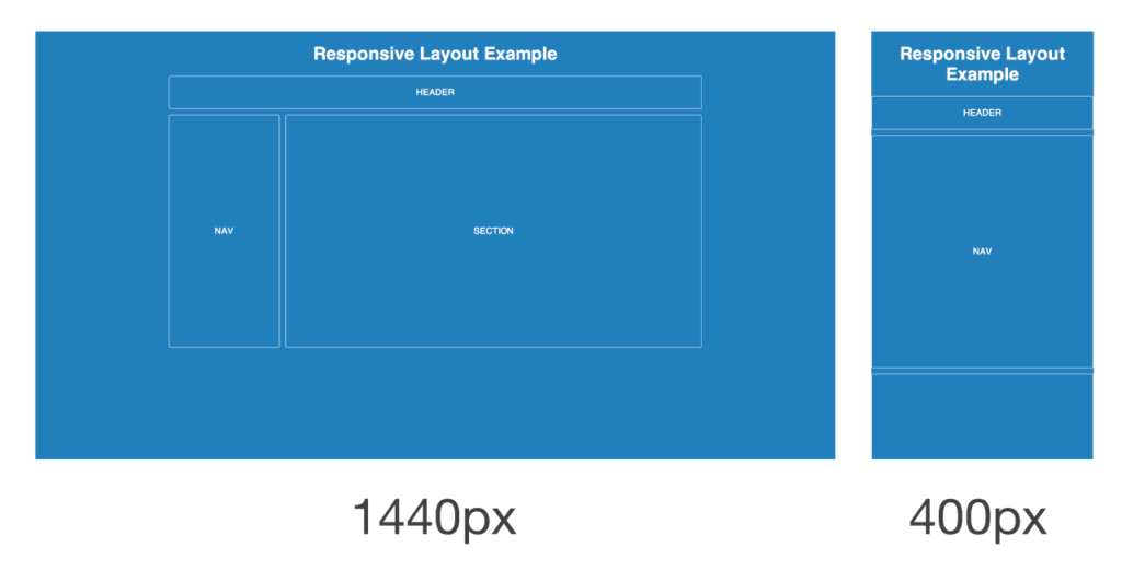
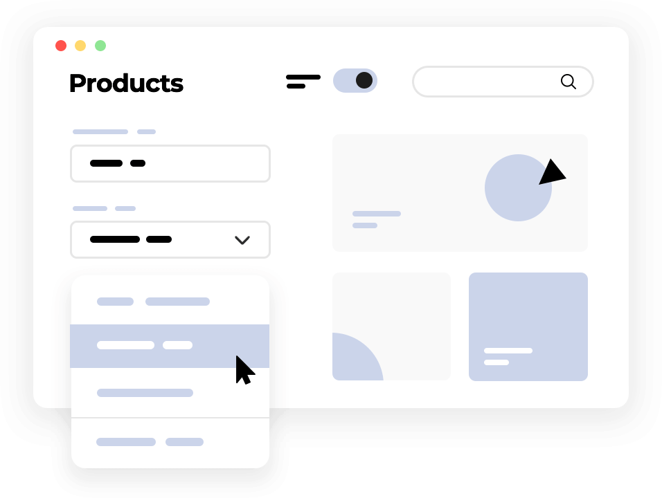
Understanding Action Elements in Web Design: Enhancing User Engagement In the dynamic realm of web design, creating visually appealing and user-friendly interfaces is paramount to capturing and retaining visitors’ attention. Amidst the myriad of design principles and techniques, one crucial aspect stands out: action elements. These components serve as the catalysts for user interaction, guiding individuals through the digital landscape and prompting them to engage with content, products, or services. In this comprehensive exploration, we delve into the nuances of action elements in web design, understanding their significance, and uncovering strategies for their effective implementation. 1. Unveiling the Essence of Action Elements Action elements, as the name suggests, are the interactive features strategically embedded within web interfaces to elicit specific responses from users. They serve as the conduits between passive browsing and active engagement, empowering visitors to navigate, explore, and interact with the website’s content. From buttons and forms to dynamic widgets and navigational aids, these elements play a pivotal role in shaping the user experience and achieving desired outcomes, whether it’s completing a purchase, subscribing to a newsletter, or initiating contact. 2. The Anatomy of Action Elements a. Buttons: Among the quintessential action elements, buttons serve as the primary triggers for user interaction. They come in various shapes, sizes, and styles, often adorned with compelling text or visually striking icons. Whether it’s a vibrant “Shop Now” button enticing users to explore products or a minimalist “Subscribe” button beckoning them to stay updated, these elements serve as the gateway to further engagement. b. Calls to Action (CTAs): Strategically placed throughout the website, CTAs serve as persuasive prompts encouraging users to take specific actions. From “Learn More” prompts enticing visitors to delve deeper into content to “Download Now” directives prompting them to access valuable resources, CTAs are crafted to be succinct, visually distinct, and compelling, compelling users to act. c. Forms: Providing a conduit for user input, forms facilitate data collection and interaction. Whether it’s capturing user information for newsletter subscriptions, processing orders through checkout forms, or enabling inquiries via contact forms, these interactive elements are instrumental in fostering communication and facilitating transactions. d. Sliders and Carousels: Beyond static imagery, sliders and carousels inject dynamism into web interfaces, showcasing a rotating array of content or products. Equipped with navigation controls, these elements enable users to browse through offerings effortlessly, providing a visually captivating experience while driving engagement. e. Menus and Navigation Bars: While primarily serving as navigational aids, menus and navigation bars also function as action elements, directing users to specific pages or sections within the website. Through intuitive organization and clear labeling, these elements streamline user navigation, ensuring seamless exploration of the website’s offerings. f. Interactive Widgets: From dynamic maps and calendars to calculators and configurators, interactive widgets offer users immersive experiences that extend beyond passive consumption. By enabling users to manipulate and interact with content, these elements foster deeper engagement and empower users to tailor their experience to their preferences. g. Hover Effects: Leveraging subtle visual cues, hover effects provide immediate feedback to users, indicating interactive elements and enhancing usability. Whether it’s changing the color or scale of a button upon hover or revealing additional information when hovering over an image, these effects heighten interactivity and enrich the browsing experience. h. Scroll-triggered Effects: As users navigate through a webpage, scroll-triggered effects come into play, dynamically revealing content or animations based on their scrolling behavior. Whether it’s a parallax effect that creates depth perception or a subtle animation that draws attention to a key message, these effects captivate users’ attention and guide them through the narrative flow of the webpage. 3. Strategies for Effective Implementation a. Strategic Placement: The placement of action elements within the webpage layout is critical to their effectiveness. By strategically positioning buttons, CTAs, and forms in prominent locations where they naturally draw users’ attention, designers can maximize engagement and conversion rates. b. Visual Hierarchy: Establishing a clear visual hierarchy ensures that action elements stand out amidst the surrounding content. Through the strategic use of color, contrast, typography, and size, designers can prioritize key elements and guide users’ focus towards desired actions. c. Consistency and Familiarity: Maintaining consistency in design conventions and interactions fosters a sense of familiarity and usability. By adhering to established patterns for buttons, forms, and navigation, designers reduce cognitive load and enhance user comprehension, facilitating intuitive interaction. d. Responsive Design: With the proliferation of mobile devices and varying screen sizes, designing action elements with responsiveness in mind is essential. By ensuring that buttons, forms, and other interactive elements adapt seamlessly to different devices and viewport sizes, designers deliver a consistent and optimized experience across platforms. e. Usability Testing and Iteration: Conducting usability testing and gathering user feedback are invaluable steps in refining the effectiveness of action elements. By observing user interactions, identifying pain points, and iteratively refining design elements based on insights gleaned from user testing, designers can optimize the user experience and drive desired outcomes. 4. Conclusion In the ever-evolving landscape of web design, action elements serve as the linchpin of user interaction and engagement. By strategically integrating buttons, CTAs, forms, and other interactive elements into web interfaces, designers can orchestrate seamless user journeys, empower visitors to navigate with ease, and drive meaningful interactions. Armed with an understanding of the anatomy of action elements and strategies for their effective implementation, designers are equipped to create compelling digital experiences that captivate, inspire, and convert. As the digital landscape continues to evolve, the role of action elements remains paramount in shaping the user experience and driving the success of online endeavors.

Understanding Action Elements in Web Design Read More »

Progressive Enhancement:

Progressive Enhancement: Responsive Design in Web Design In the ever-evolving landscape of web design, two principles have emerged as cornerstones of creating user-friendly and accessible websites: Progressive Enhancement and Responsive Design. While these concepts are often discussed separately, they are closely intertwined, with Progressive Enhancement serving as a foundational philosophy within the framework of Responsive Design. In this comprehensive article, we will delve into the intricacies of Progressive Enhancement and its role in shaping modern web design practices, particularly in the context of creating responsive websites. Understanding Progressive Enhancement Progressive Enhancement is a design strategy that advocates for building websites in layers, starting with a basic, universally accessible version and then progressively enhancing it with additional features and styles for devices and browsers that can support them. At its core, Progressive Enhancement embodies the philosophy of inclusivity, ensuring that all users, regardless of their device capabilities or browsing environment, can access the core content and functionality of a website. The key principles of Progressive Enhancement can be summarized as follows: The Role of Progressive Enhancement in Responsive Design Responsive Design, another fundamental concept in modern web design, is closely aligned with Progressive Enhancement. Responsive Design refers to the practice of creating websites that adapt and respond to the user’s device and screen size, providing an optimal viewing and interaction experience across a range of devices, from desktop computers to smartphones and tablets. Progressive Enhancement plays a pivotal role in the implementation of Responsive Design by providing a framework for building adaptable and flexible websites. Here’s how Progressive Enhancement contributes to Responsive Design: Best Practices for Implementing Progressive Enhancement in Responsive Design To effectively integrate Progressive Enhancement into Responsive Design, consider the following best practices: Conclusion Progressive Enhancement and Responsive Design are complementary principles that form the foundation of modern web design practices. By embracing Progressive Enhancement within the framework of Responsive Design, designers can create websites that are not only visually appealing and accessible but also adaptable to the diverse array of devices and browsers used by today’s users. By starting with a basic, universally accessible version and progressively enhancing it for different devices and environments, designers can ensure that their websites provide an optimal user experience for all users, regardless of their device capabilities or browsing preferences.

Progressive Enhancement: Read More »

Viewport Meta Tag

Understanding the Viewport Meta Tag in Responsive Web Design In the realm of web design, where users access websites through an ever-expanding array of devices, ensuring a consistent and optimized experience across various screen sizes is paramount. Responsive web design has emerged as the solution to this challenge, offering a dynamic approach to crafting websites that adapt seamlessly to different devices. At the heart of responsive design lies the viewport meta tag, a crucial element that controls how a webpage is displayed on mobile devices. In this comprehensive guide, we delve deep into the viewport meta tag, exploring its significance, implementation, and impact on responsive web design. What is the Viewport Meta Tag? The viewport meta tag is a special HTML meta tag that allows web developers to control the layout and scaling of a webpage on mobile devices. It provides instructions to the browser on how to adjust the dimensions and scaling of the viewport—the visible area of the webpage displayed on the screen—to ensure optimal rendering and usability, particularly on devices with varying screen sizes and resolutions. Significance of the Viewport Meta Tag In the absence of the viewport meta tag, mobile browsers typically render web pages at a default desktop viewport width, resulting in the need for users to pinch, zoom, and scroll horizontally to view content, leading to a subpar user experience. The viewport meta tag addresses this issue by enabling developers to define the initial scale, width, and other viewport properties, allowing websites to adapt fluidly to the dimensions of the user’s device. Key Properties of the Viewport Meta Tag Implementation of the Viewport Meta Tag To integrate the viewport meta tag into a webpage, developers include it within the HTML head section using the following syntax: This example configures the viewport to match the device width and sets the initial zoom level to 100%, ensuring that the webpage is displayed at full width without any initial zooming. Impact on Responsive Web Design The viewport meta tag serves as a cornerstone of responsive web design, enabling websites to adapt dynamically to the diverse landscape of mobile devices. By defining the viewport properties, developers can create layouts that fluidly adjust to varying screen sizes, ensuring an optimal viewing experience for users across smartphones, tablets, and other devices. Challenges and Best Practices While the viewport meta tag empowers developers to create responsive websites, its implementation requires careful consideration of factors such as font sizes, touch targets, and media queries to deliver a cohesive and user-friendly experience across devices. Adhering to best practices, such as using relative units for font sizes and ensuring adequate touch target sizes, can help mitigate common pitfalls and optimize the responsiveness of web pages. Conclusion In conclusion, the viewport meta tag plays a central role in responsive web design, providing developers with the means to craft websites that seamlessly adapt to the myriad of devices used by modern audiences. By understanding the significance of the viewport meta tag and implementing it effectively, web designers can ensure that their creations deliver an exceptional user experience across desktops, smartphones, and everything in between. Embracing responsive design principles and harnessing the power of the viewport meta tag are essential steps towards building websites that thrive in today’s multi-device landscape.

Viewport Meta Tag Read More »

Media Queries and Responsive Design

Understanding Media Queries and Responsive Design in Web Design In the dynamic landscape of the internet, where users access websites on a multitude of devices ranging from desktops to smartphones and tablets, ensuring a seamless user experience has become paramount for web designers. This is where the principles of responsive design, powered by media queries, come into play. In this article, we’ll delve into the intricacies of media queries and their role in creating responsive web designs. What are Media Queries? Media queries are a key component of responsive web design. They are CSS rules that enable developers to apply different styles to a webpage based on various characteristics of the user’s device, such as screen width, height, orientation, and resolution. By utilizing media queries, designers can create layouts that adapt fluidly to different screen sizes and devices, ensuring optimal viewing experiences for users across the board. The Anatomy of a Media Query A typical media query consists of a media type and one or more expressions that define the conditions under which the associated styles should be applied. Here’s a basic syntax of a media query: Creating Responsive Layouts with Media Queries One of the primary goals of responsive design is to create layouts that adapt seamlessly to different screen sizes and resolutions. Media queries play a crucial role in achieving this goal by allowing designers to define breakpoints at which the layout should change to accommodate varying screen sizes. For example, consider a simple media query that adjusts the layout when the screen width is less than or equal to 768 pixels: Within this media query block, designers can specify CSS rules to reconfigure the layout, such as adjusting the size and positioning of elements, changing the number of columns in a grid, or hiding/displaying certain content based on screen size. Optimizing Images and Media for Different Devices In addition to layout adjustments, media queries are also used to optimize images and media for different devices. By setting maximum widths on images and media elements, designers can ensure that they scale down proportionally to fit smaller screens without sacrificing quality or breaking the layout. Implementing Mobile-first Design A popular approach to responsive design is the mobile-first approach, which involves designing for mobile devices first and then progressively enhancing the layout for larger screens. Media queries are instrumental in this approach, as they allow designers to add styles for larger screens using min-width breakpoints. Conclusion In conclusion, media queries are indispensable tools in the arsenal of web designers for creating responsive and adaptive layouts that cater to the diverse array of devices and screen sizes used by modern internet users. By leveraging media queries effectively, designers can craft websites that deliver optimal user experiences across desktops, laptops, smartphones, tablets, and beyond, ensuring that content remains accessible and engaging regardless of the device being used.

Media Queries and Responsive Design Read More »

Flexible Images and Media

Flexible Images and Media: Responsive Design in Web Design In the rapidly evolving landscape of web design, ensuring that websites adapt seamlessly to the diverse array of devices and screen sizes used by visitors has become paramount. Responsive design, a methodology that prioritizes fluidity and adaptability, lies at the heart of this endeavor. Within the realm of responsive design, the concept of flexible images and media plays a pivotal role, ensuring that visual elements remain accessible and aesthetically pleasing across various devices. Let’s delve deeper into this crucial aspect of web design. Understanding Flexible Images and Media At its core, flexible images and media refer to the practice of designing visual elements—such as images, videos, and other multimedia content—in a manner that allows them to dynamically adjust their size and layout based on the screen dimensions of the user’s device. Unlike traditional fixed-width images that may appear distorted or cropped on smaller screens, flexible media seamlessly resizes to fit the available space while maintaining clarity and visual integrity. The Importance of Responsive Design In an era characterized by the proliferation of smartphones, tablets, and an ever-expanding array of internet-enabled devices, the need for responsive design has never been more pronounced. Users expect a consistent and user-friendly experience regardless of whether they access a website from their desktop computer, smartphone, or tablet. Responsive design not only meets this expectation but also enhances user engagement, boosts conversion rates, and improves overall accessibility. Techniques for Implementing Flexible Images and Media Benefits of Flexible Images and Media Conclusion Flexible images and media are integral components of responsive design, enabling websites to adapt gracefully to the ever-changing landscape of digital devices. By embracing fluid layouts, employing CSS techniques, and leveraging media queries, designers can create visually stunning and universally accessible web experiences. In an era where user expectations are continually evolving, prioritizing responsive design principles ensures that websites remain relevant, engaging, and accessible to all.

Flexible Images and Media Read More »

Scroll to Top

Search