Author name: RC

The Art of Font Choice in Web Design

The Art of Font Choice in Web Design: A Comprehensive Guide In the realm of web design, typography stands as one of the cornerstone elements influencing user experience, brand identity, and overall aesthetics. Font choice, in particular, holds immense significance, as it not only affects readability but also communicates the essence of a website’s content and brand personality. In this comprehensive guide, we delve deep into the nuances of font choice for web design, exploring its intricacies and providing actionable insights for designers to create compelling typographic experiences. Understanding Font Families: Fonts are often categorized into different families based on their stylistic attributes. The primary font families used in web design include serif, sans-serif, display, and monospaced. Factors Influencing Font Choice: When selecting fonts for web design, several factors come into play, each contributing to the overall typographic harmony and effectiveness: Best Practices for Font Selection: While the selection of fonts may seem subjective, adhering to best practices can streamline the decision-making process and elevate the typographic quality of web design: Conclusion: In the intricate tapestry of web design, font choice emerges as a pivotal element, weaving together aesthetics, functionality, and brand communication. By understanding the nuances of font families, considering key factors influencing font selection, and adhering to best practices, designers can harness the power of typography to create captivating and user-centric web experiences. As technology evolves and design trends shift, the art of font choice remains timeless—a testament to its enduring impact on the digital landscape.

The Art of Font Choice in Web Design Read More »

Typography for Web Design

Typography plays a fundamental role in web design, influencing how users perceive and interact with digital content. Whether you’re just starting out in web design or you’re an experienced professional, understanding the principles of typography is essential for creating visually appealing, readable, and effective websites. In this comprehensive guide, we’ll explore everything you need to know about typography for web design, from the basics to advanced techniques. 1. Introduction to Typography Typography is the art and technique of arranging type to make written language legible, readable, and visually appealing. In web design, typography encompasses various elements such as font choice, font size, spacing, line length, line spacing, and text alignment. 2. Importance of Typography in Web Design Typography plays a crucial role in shaping the user experience on a website. It helps convey information effectively, establish hierarchy and visual flow, evoke emotions, and reinforce brand identity. Well-executed typography enhances readability and engagement, ultimately improving the overall usability of a website. 3. Basic Principles of Typography 4. Advanced Typography Techniques 5. Responsive Typography With the prevalence of different screen sizes and devices, it’s important to implement responsive typography that adjusts dynamically to accommodate various viewport sizes. Use relative units like percentages, ems, or rems for font sizes and line heights to ensure scalability across different devices. 6. Web Fonts Web fonts allow designers to use custom fonts that may not be available on users’ devices. Services like Google Fonts, Adobe Fonts, and Typekit provide a wide selection of web fonts that can be easily integrated into web designs using CSS. Conclusion Typography is a critical aspect of web design, impacting both the aesthetics and functionality of a website. By mastering the principles of typography and applying them thoughtfully, designers can create engaging, readable, and visually stunning websites that leave a lasting impression on users. Whether you’re a beginner or an expert, understanding typography is essential for creating successful web experiences.

Typography for Web Design Read More »

The Basics of Color Schemes for Web Design

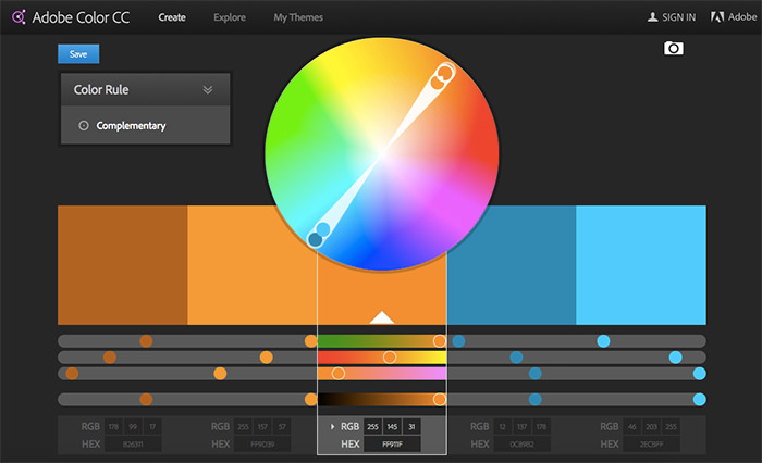
The Basics of Color Schemes for Web Design: Enhancing User Experience Through Visual Harmony In the realm of web design, color plays a pivotal role in shaping user experiences, influencing perceptions, and communicating brand messages effectively. A well-crafted color scheme can captivate visitors, guide them through content, and evoke desired emotions. Understanding the fundamentals of color schemes is essential for web designers to create visually appealing and cohesive websites. In this comprehensive guide, we delve into the basics of color schemes for web design, exploring various concepts, principles, and best practices. Introduction to Color Theory At the core of understanding color schemes lies the foundation of color theory. Color theory is a set of principles and guidelines that elucidate how colors interact with each other and the human eye. By familiarizing oneself with color theory, designers gain insights into creating harmonious and aesthetically pleasing color combinations. Basic Color Theory Color theory encompasses a multitude of definitions, concepts and design applications – enough to fill several encyclopedias. However, there are three basic categories of color theory that are logical and useful : The color wheel, color harmony, and the context of how colors are used. Color theories create a logical structure for color. For example, if we have an assortment of fruits and vegetables, we can organize them by color and place them on a circle that shows the colors in relation to each other. The Color Wheel A color circle, based on red, yellow and blue, is traditional in the field of art. Sir Isaac Newton developed the first circular diagram of colors in 1666. Since then, scientists and artists have studied and designed numerous variations of this concept. Differences of opinion about the validity of one format over another continue to provoke debate. In reality, any color circle or color wheel which presents a logically arranged sequence of pure hues has merit. There are also definitions (or categories) of colors based on the color wheel. We begin with a 3-part color wheel. Primary Colors: Red, yellow and blueIn traditional color theory (used in paint and pigments), primary colors are the 3 pigment colors that cannot be mixed or formed by any combination of other colors. All other colors are derived from these 3 hues.  Secondary Colors: Green, orange and purpleThese are the colors formed by mixing the primary colors. Tertiary Colors: Yellow-orange, red-orange, red-purple, blue-purple, blue-green & yellow-greenThese are the colors formed by mixing a primary and a secondary color. That’s why the hue is a two word name, such as blue-green, red-violet, and yellow-orange.  Color Harmony Harmony can be defined as a pleasing arrangement of parts, whether it be music, poetry, color, or even an ice cream sundae. In visual experiences, harmony is something that is pleasing to the eye. It engages the viewer and it creates an inner sense of order, a balance in the visual experience. When something is not harmonious, it’s either boring or chaotic. At one extreme is a visual experience that is so bland that the viewer is not engaged. The human brain will reject under-stimulating information. At the other extreme is a visual experience that is so overdone, so chaotic that the viewer can’t stand to look at it. The human brain rejects what it cannot organize, what it cannot understand. The visual task requires that we present a logical structure. Color harmony delivers visual interest and a sense of order. In summary, extreme unity leads to under-stimulation, extreme complexity leads to over-stimulation. Harmony is a dynamic equilibrium. Some Formulas for Color Harmony There are many theories for harmony. The following illustrations and descriptions present some basic formulas. 1. A color scheme based on analogous colors Analogous colors are any three colors which are side by side on a 12-part color wheel, such as yellow-green, yellow, and yellow-orange. Usually one of the three colors predominates.  2. A color scheme based on complementary colors Complementary colors are any two colors which are directly opposite each other, such as red and green and red-purple and yellow-green. In the illustration above, there are several variations of yellow-green in the leaves and several variations of red-purple in the orchid. These opposing colors create maximum contrast and maximum stability.  3. A color scheme based on nature Nature provides a perfect departure point for color harmony. In the illustration above, red yellow and green create a harmonious design, regardless of whether this combination fits into a technical formula for color harmony. Components of Color Before delving into color schemes, it’s imperative to grasp the components of color: Types of Color Schemes Understanding the different types of color schemes empowers designers to select the most suitable palette for their web projects. Some common color schemes include: Color Psychology in Web Design Beyond aesthetics, colors possess psychological attributes that can influence user behavior and perception. By harnessing the principles of color psychology, designers can evoke specific emotions and responses from website visitors. For instance: Achieving Color Harmony Harmony is key to a successful color scheme, ensuring that colors complement each other and contribute to a unified visual experience. Designers can achieve harmony through: Accessibility and Color Contrast Accessibility is a critical consideration in web design, and color plays a significant role in ensuring inclusivity for all users. Designers should adhere to accessibility standards, such as the Web Content Accessibility Guidelines (WCAG), to ensure sufficient color contrast for readability. Tools and resources are available to evaluate color combinations and ensure compliance with accessibility guidelines. Cultural and Contextual Considerations Colors can carry different meanings and cultural associations across diverse audiences and contexts. Designers should be mindful of cultural sensitivities and preferences when selecting color schemes, especially for global or multicultural audiences. Conducting research and soliciting feedback from target demographics can help designers make informed color choices. Tools and Resources for Color Selection Numerous tools and resources are available to assist designers in selecting and refining color schemes for web projects. From color palette generators to accessibility checkers, these tools streamline the color

The Basics of Color Schemes for Web Design Read More »

Cultural and Contextual Considerations for Web Design

Cultural and Contextual Considerations for Web Design In the interconnected global landscape of the internet, web design has evolved beyond mere aesthetics to encompass cultural and contextual considerations. As the online audience becomes increasingly diverse, understanding the cultural nuances and contextual factors that influence user behavior and perceptions is essential for creating inclusive and effective web experiences. In this article, we explore the significance of cultural and contextual considerations in web design, along with practical strategies for implementing them. Understanding Cultural Diversity Cultural diversity refers to the variety of cultural perspectives, practices, and values that exist within a society or community. In the context of web design, cultural diversity manifests in various ways, including language, symbolism, color preferences, social norms, and user expectations. Designers must recognize and respect these cultural differences to ensure that their websites are accessible and engaging to a global audience. Language and Communication Language is a fundamental aspect of culture and plays a crucial role in effective communication on the web. Designers should consider the linguistic diversity of their target audience and provide multilingual options when appropriate. This includes not only translating textual content but also adapting cultural references, idiomatic expressions, and colloquialisms to resonate with different language speakers. Symbolism and Imagery Symbols and imagery often carry cultural meanings and associations that may vary across different societies and regions. Designers should be mindful of using culturally sensitive symbols, icons, and visuals to avoid unintentionally offending or alienating users. Conducting research or consulting with local experts can help ensure that imagery is culturally appropriate and resonates with the target audience. Color Symbolism Colors hold symbolic significance in many cultures and can evoke different emotions and perceptions. For example, while white may symbolize purity and peace in Western cultures, it may represent mourning or death in some Asian cultures. Designers should be cognizant of cultural color associations and consider how color choices may be interpreted by diverse audiences. Adapting to Contextual Factors In addition to cultural considerations, web design must also account for contextual factors that influence user interaction and engagement. Contextual factors encompass the user’s environment, situation, device, and browsing context, all of which shape their online experience. By understanding these contextual variables, designers can create more relevant and user-centric web interfaces. Device and Platform Diversity Users access the web through a myriad of devices and platforms, including desktop computers, smartphones, tablets, and smart TVs. Each device has its own screen size, resolution, input method, and capabilities, which can impact how users interact with websites. Designers should embrace responsive design principles to ensure that websites adapt seamlessly to different devices and provide a consistent user experience across platforms. Browsing Context The context in which users access a website can influence their behavior and expectations. For instance, users browsing on-the-go may have different needs and preferences compared to those browsing from the comfort of their homes. Designers should consider the user’s context, such as their location, time of day, and task at hand, to tailor the website experience accordingly. Accessibility and Inclusivity Accessibility is a critical aspect of web design that ensures equal access and usability for all users, including those with disabilities. Designers should adhere to web accessibility standards, such as the Web Content Accessibility Guidelines (WCAG), to accommodate users with visual, auditory, motor, or cognitive impairments. This includes providing alternative text for images, keyboard navigation support, and semantic HTML markup. Practical Strategies for Implementation Implementing cultural and contextual considerations in web design requires a proactive and holistic approach. Here are some practical strategies for integrating these considerations into the design process: Conduct User Research Before designing a website, conduct thorough user research to understand the cultural backgrounds, preferences, and behaviors of the target audience. Use surveys, interviews, and usability testing to gather insights and validate design decisions. Collaborate with Local Experts Engage with cultural experts, translators, and native speakers to ensure cultural authenticity and sensitivity in content creation and design. Their expertise can help identify potential cultural pitfalls and provide valuable insights into local customs and norms. Test Across Different Contexts Test the website across various contexts, devices, and user scenarios to identify usability issues and opportunities for improvement. Consider conducting usability testing in different geographical locations to capture diverse perspectives and feedback. Iterate and Adapt Web design is an iterative process, and ongoing adaptation is essential for staying responsive to cultural shifts and evolving user needs. Monitor website analytics, gather user feedback, and iteratively refine the design to enhance cultural relevance and usability. Conclusion In today’s multicultural and digitally interconnected world, cultural and contextual considerations play a pivotal role in shaping successful web experiences. By embracing cultural diversity, understanding contextual factors, and implementing inclusive design practices, designers can create websites that resonate with diverse audiences and foster meaningful engagement. By prioritizing cultural and contextual considerations, web design can transcend boundaries and bridge cultural divides, ultimately enriching the online experience for all users.

Cultural and Contextual Considerations for Web Design Read More »

Color Tools for Web Design

Exploring Color Tools for Web Design: Enhancing Creativity and Efficiency In the realm of web design, colors play a pivotal role in shaping the user experience, establishing brand identity, and conveying messages effectively. Choosing the right color scheme can significantly impact how visitors perceive and interact with a website. To aid designers in this crucial task, a plethora of color tools are available, offering diverse functionalities to streamline the color selection process and enhance creativity. In this article, we delve into the realm of color tools for web design, exploring their features, benefits, and how they contribute to the design workflow. Understanding the Importance of Color Tools Color tools serve as invaluable resources for web designers, offering a range of features to facilitate the creation and implementation of color schemes. These tools not only provide access to an extensive array of colors but also offer functionalities such as color harmony exploration, contrast checking, and accessibility assessments. By leveraging these tools, designers can streamline their workflow, experiment with different color combinations, and ensure that their designs are visually compelling and accessible to all users. Key Features of Color Tools Popular Color Tools for Web Design Integrating Color Tools into the Design Workflow Incorporating color tools into the design workflow can streamline the color selection process and foster creativity. Designers can begin by exploring different color palettes and experimenting with color combinations using palette generation tools. They can then use color pickers to extract colors from visual assets or existing brand identities. Throughout the design process, it’s essential to consider accessibility guidelines and use contrast checking tools to ensure readability for all users. Conclusion Color tools play a pivotal role in web design, empowering designers to create visually stunning and accessible websites. By leveraging the diverse functionalities offered by these tools, designers can explore, experiment, and refine color schemes with ease. Whether it’s generating color palettes, exploring color harmonies, or assessing accessibility, these tools enhance efficiency and creativity in the design process. As the digital landscape continues to evolve, color tools remain indispensable resources for crafting compelling and inclusive web experiences. In conclusion, color tools for web design offer a wealth of features and functionalities to streamline the color selection process and enhance creativity. By understanding their capabilities and integrating them into the design workflow, designers can create visually compelling and accessible websites that resonate with users. With a plethora of options available, exploring and experimenting with color has never been more exciting in the realm of web design.

Color Tools for Web Design Read More »

Accessibility in Web Design

Accessibility in Web Design: Empowering Inclusivity and Usability In today’s digital age, the internet serves as a vital platform for communication, commerce, education, and more. However, not everyone experiences the web in the same way. For individuals with disabilities, navigating websites can present significant challenges. Web designers and developers play a crucial role in addressing these challenges by prioritizing accessibility. Accessibility in web design refers to creating websites and web applications that are usable and navigable by people with diverse abilities and disabilities. In this comprehensive guide, we’ll delve into the importance of accessibility, key principles, best practices, and tools to ensure that websites are inclusive and user-friendly for all. Why Accessibility Matters Accessibility is not just a moral imperative; it’s also a legal requirement in many jurisdictions. Laws such as the Americans with Disabilities Act (ADA) in the United States and the Web Content Accessibility Guidelines (WCAG) established by the World Wide Web Consortium (W3C) set standards for web accessibility. Failure to comply with these regulations can result in legal consequences, including lawsuits and fines. Beyond legal compliance, accessibility is essential for fostering inclusivity and ensuring that everyone, regardless of ability, can access and interact with online content. Key Principles of Web Accessibility Effective web accessibility is guided by several key principles: Best Practices for Web Accessibility Achieving accessibility requires a holistic approach encompassing design, development, content creation, and testing. Here are some best practices to consider: Tools for Ensuring Accessibility Numerous tools and resources are available to assist designers and developers in creating accessible websites: Conclusion Accessibility is a fundamental aspect of web design that promotes inclusivity, usability, and compliance with legal requirements. By adhering to accessibility principles, implementing best practices, and leveraging appropriate tools, designers and developers can create websites that are accessible to all users, regardless of their abilities or disabilities. Investing in accessibility not only enhances the user experience but also reflects a commitment to equality and social responsibility in the digital realm. Let’s strive to build a web that is accessible and welcoming to everyone.

Accessibility in Web Design Read More »

Color Harmony in Web Design

Exploring Color Harmony in Web Design: Creating Aesthetically Pleasing and Effective Interfaces In the realm of web design, color harmony plays a pivotal role in shaping user experiences, establishing brand identities, and conveying messages effectively. The thoughtful selection and arrangement of colors can significantly impact the overall aesthetics and usability of a website. In this article, we delve into the concept of color harmony, exploring its importance, principles, and practical applications in web design. Understanding Color Harmony Color harmony refers to the pleasing arrangement of colors in a design that creates a sense of balance and unity. Achieving harmony involves selecting colors that complement each other and arranging them in a way that is visually appealing. By leveraging principles of color theory and design aesthetics, web designers can create cohesive and engaging user interfaces. The Importance of Color Harmony in Web Design In the digital landscape, where users are inundated with information and stimuli, color harmony serves as a powerful tool to capture attention, guide navigation, and evoke desired emotions. A harmonious color scheme can enhance usability, improve brand recognition, and foster positive perceptions of a website. Principles of Color Harmony Several principles govern the creation of color harmony in web design: Practical Applications in Web Design Implementing color harmony principles in web design involves a series of strategic decisions: Conclusion Color harmony is a fundamental aspect of web design that influences user perceptions, interactions, and brand associations. By understanding the principles of color theory and applying them thoughtfully, designers can create visually captivating and functionally effective websites. Whether crafting brand identities, designing user interfaces, or enhancing accessibility, color harmony remains an indispensable tool for shaping digital experiences in the ever-evolving landscape of web design.

Color Harmony in Web Design Read More »

Color Psychology in Web Design

Understanding Color Psychology in Web Design In the realm of web design, color is far more than just an aesthetic choice. It’s a powerful tool that can influence emotions, perceptions, and user behavior. The field of color psychology delves into how different colors impact human cognition and emotions, offering invaluable insights for web designers seeking to create engaging and effective online experiences. What is Color Psychology? Color psychology is the study of how colors affect human behavior, mood, and mental processes. It explores the psychological and emotional responses elicited by different colors, as well as the cultural and contextual influences on these reactions. In web design, understanding color psychology enables designers to strategically use colors to evoke specific feelings, convey messages, and guide user interactions. The Impact of Color in Web Design Color plays a crucial role in shaping the user experience on websites. From influencing first impressions to guiding navigation and encouraging conversions, color choices can significantly impact how visitors perceive and interact with a website. Here’s a closer look at some key aspects of color psychology in web design: 1. First Impressions When users land on a website, their initial impressions are heavily influenced by its color scheme. Different colors evoke different emotions and associations, which can shape users’ perceptions of the brand, product, or content. For example, vibrant and warm colors like red or orange may convey energy and excitement, while cool tones like blue or green might evoke a sense of calm and professionalism. 2. Brand Identity Color plays a central role in brand identity, serving as a visual representation of a brand’s personality, values, and positioning. Consistent use of color across a website reinforces brand recognition and strengthens brand recall. Designers must align color choices with the brand’s identity and target audience to effectively communicate its message and evoke the desired emotions. 3. User Engagement Color can influence user engagement and interaction on a website. Calls-to-action (CTAs) and important elements can be highlighted using contrasting colors to draw attention and encourage clicks. Additionally, the use of color gradients, animations, and visual effects can enhance user engagement and create a more immersive browsing experience. 4. Information Hierarchy In web design, color can be used to establish information hierarchy and guide users’ attention. By assigning different colors to various elements such as headings, subheadings, and body text, designers can create visual cues that help users navigate and digest content more effectively. Strong contrasts between text and background colors also improve readability and accessibility. 5. Emotional Response Colors have the power to evoke specific emotions and moods, which can influence users’ perceptions and behaviors on a website. For example, warm colors like red, orange, and yellow are often associated with energy, passion, and urgency, making them effective for CTAs or promotional banners. In contrast, cool colors like blue and green are calming and reassuring, suitable for creating a sense of trust and reliability. 6. Cultural Considerations It’s essential to consider cultural differences and associations when choosing colors for a website, especially in a globalized context. Colors can have diverse meanings and symbolism across cultures, and what may be perceived positively in one culture could have negative connotations in another. Conducting research and understanding the cultural context of the target audience can help designers avoid unintended misunderstandings or misinterpretations. Conclusion Color psychology is a powerful tool for web designers seeking to create compelling and user-centric experiences. By understanding the emotional and psychological impact of colors, designers can make informed decisions that resonate with users, reinforce brand identity, and drive desired actions. Whether it’s establishing a cohesive brand identity, guiding user interactions, or creating engaging visual experiences, color psychology remains a cornerstone of effective web design.

Color Psychology in Web Design Read More »

Types of Color Schemes for Web Design

Exploring Types of Color Schemes for Web Design Color plays a crucial role in web design, influencing not only the aesthetic appeal but also the user experience and brand identity. Choosing the right color scheme can significantly impact how visitors perceive and interact with a website. By understanding different types of color schemes and their applications, web designers can create visually appealing and effective online experiences. In this article, we’ll delve into various types of color schemes commonly used in web design, exploring their characteristics, benefits, and best practices. 1. Monochromatic Color Scheme A monochromatic color scheme revolves around a single base color, with variations in saturation and brightness. This type of scheme creates a harmonious and unified look, making it suitable for minimalist designs or when aiming for a subtle, sophisticated aesthetic. By using different shades and tints of the same hue, designers can achieve visual interest without overwhelming the viewer. Monochromatic schemes are versatile and well-suited for conveying a sense of elegance and simplicity. Benefits: Best Practices: 2. Analogous Color Scheme An analogous color scheme consists of colors that are adjacent to each other on the color wheel. This type of scheme creates a sense of harmony and cohesion, making it effective for conveying a unified theme or mood. Analogous schemes often evoke natural and soothing associations, making them suitable for websites related to health, wellness, or nature. Designers can explore variations within the chosen color range to add visual interest while maintaining consistency. Benefits: Best Practices: 3. Complementary Color Scheme A complementary color scheme involves colors that are opposite each other on the color wheel. This type of scheme creates high contrast and vibrancy, making it effective for grabbing attention and creating visual impact. Complementary schemes often feature a primary color paired with its direct complement, creating a dynamic and energetic palette. However, using complementary colors in large doses can be overwhelming, so designers should use them strategically to avoid visual fatigue. Benefits: Best Practices: 4. Triadic Color Scheme A triadic color scheme involves three colors that are evenly spaced around the color wheel, forming an equilateral triangle. This type of scheme offers a balance between contrast and harmony, making it versatile and visually appealing. Triadic schemes provide opportunities for creativity and dynamism while maintaining overall coherence. Designers can experiment with different combinations of primary, secondary, or tertiary colors to achieve various effects. Benefits: Best Practices: 5. Split-Complementary Color Scheme A split-complementary color scheme is similar to a complementary scheme but uses a base color paired with the two colors adjacent to its complement. This type of scheme offers the contrast of complementary colors while reducing the potential for visual overload. Split-complementary schemes provide a balanced and visually appealing palette, making them suitable for a wide range of design applications. Benefits: Best Practices: Conclusion In web design, color schemes play a crucial role in shaping the overall look and feel of a website. By understanding the characteristics and applications of different types of color schemes, designers can create visually compelling and effective online experiences. Whether aiming for harmony and cohesion or contrast and impact, choosing the right color scheme is essential for conveying the desired message and engaging the audience effectively. By leveraging the versatility and creative potential of various color schemes, web designers can elevate their designs and create memorable user experiences.

Types of Color Schemes for Web Design Read More »

Color Schemes in Web Design

Mastering Color Schemes in Web Design: Crafting Engaging Digital Experiences Introduction:Color is a fundamental element of web design, wielding immense power to shape perceptions, evoke emotions, and guide user interactions. In the competitive realm of the internet, where attention spans are fleeting and first impressions are critical, the strategic use of color schemes is paramount. This article delves deep into the art and science of color schemes in web design, exploring their significance, principles, practical applications, and emerging trends. The Importance of Color Schemes in Web Design In the digital landscape, color schemes serve as a visual language that communicates brand identity, enhances usability, and influences user behavior. They play a pivotal role in creating memorable experiences, guiding users through interfaces, and establishing visual hierarchy. A well-crafted color scheme can elevate a website’s aesthetic appeal, improve readability, and foster a connection with the audience. Understanding Color Theory At the core of effective color scheme design lies a comprehensive understanding of color theory. The color wheel, comprising primary, secondary, and tertiary colors, provides a framework for exploring color harmonies and contrasts. Designers leverage principles such as complementary, analogous, triadic, and monochromatic color schemes to achieve balance, contrast, and visual impact. By mastering color theory, designers can create cohesive and visually pleasing compositions that resonate with users. Practical Applications of Color Schemes In web design, color schemes extend beyond mere decoration—they serve functional purposes that shape user experiences. From establishing brand identity to guiding navigation, color schemes influence every aspect of a website’s design. For instance, a minimalist color palette might convey sophistication and elegance, while bold contrasts can create a sense of vibrancy and energy. Moreover, designers must consider accessibility standards to ensure inclusivity and usability for all users. Emerging Trends in Color Scheme Design As design trends evolve and user preferences shift, color scheme design continues to evolve. In recent years, minimalist aesthetics, bold color contrasts, and dark mode interfaces have gained traction in web design. Additionally, the advent of responsive design has prompted designers to explore adaptive color schemes that seamlessly adjust across different devices and screen sizes. Furthermore, advancements in color psychology research have led to a deeper understanding of how colors influence user perceptions and behaviors, driving innovation in color scheme design. Tools and Resources for Color Scheme Design Fortunately, designers have access to a wealth of tools and resources to streamline the color scheme design process. From color palette generators to accessibility testing tools, these resources empower designers to experiment with colors, analyze their impact, and refine their choices. Online communities and forums also provide valuable insights and feedback, fostering collaboration and knowledge sharing within the design community. Conclusion In the dynamic landscape of web design, mastering color schemes is essential for creating engaging and immersive digital experiences. By harnessing the principles of color theory, embracing emerging trends, and leveraging available tools and resources, designers can craft visually stunning and user-friendly websites that captivate audiences. As technology evolves and user expectations evolve, staying at the forefront of color scheme design is key to success in the ever-changing digital landscape.

Color Schemes in Web Design Read More »

Scroll to Top

Search