Author name: RC

Icons in Web Design

Understanding Icons in Web Design: Enhancing User Experience Through Visual Communication In the vast landscape of web design, icons stand as powerful graphic elements that transcend language barriers and communicate messages swiftly and effectively. From navigation menus to calls to action, icons play a pivotal role in guiding users, enhancing usability, and elevating the overall aesthetic appeal of a website. Understanding the nuances of icon design and implementation is essential for crafting compelling web experiences that resonate with users. Let’s delve deeper into the world of icons in web design, exploring their significance, best practices, and emerging trends. Significance of Icons in Web Design Icons serve as visual shortcuts, encapsulating complex ideas or actions into simple, recognizable symbols. They transcend linguistic barriers, making them universally understandable and accessible to users across diverse demographics and cultures. In a digital era characterized by short attention spans and information overload, icons offer a concise and intuitive way to navigate and interact with websites. Enhancing Usability One of the primary functions of icons in web design is to enhance usability by improving navigation and user interaction. They provide visual cues that guide users through the website’s interface, helping them locate essential functions, content, or features with ease. For example, a magnifying glass icon commonly denotes search functionality, while a home icon signifies returning to the homepage. By incorporating icons strategically, designers can streamline user journeys and minimize cognitive load, thereby fostering a more intuitive and user-friendly experience. Visual Hierarchy and Brand Identity Icons contribute to the visual hierarchy of a website, guiding users’ attention and prioritizing information effectively. When used in conjunction with text and other graphical elements, icons help create a balanced and harmonious layout that directs users’ focus towards key elements. Moreover, icons play a crucial role in reinforcing brand identity, serving as visual representations of a brand’s values, personality, and offerings. Consistent use of branded icons can establish a cohesive visual language that strengthens brand recognition and fosters user trust and loyalty. Best Practices for Icon Design Effective icon design requires careful consideration of various factors, including clarity, consistency, scalability, and accessibility. Adhering to best practices ensures that icons fulfill their intended purpose while enhancing the overall user experience. Clarity and Simplicity Icons should be designed with clarity and simplicity in mind, ensuring that their meaning is instantly recognizable without the need for explanation. Avoid overly complex or abstract designs that may confuse users or detract from usability. Instead, opt for clean, minimalist shapes and clear imagery that convey the intended message at a glance. Consistency and Familiarity Maintaining consistency in iconography is essential for establishing a cohesive visual language and facilitating user understanding. Use standardized iconography where possible, adhering to familiar symbols and conventions that users are likely to recognize from their prior online experiences. Consistent styling, size, and alignment of icons contribute to a polished and professional aesthetic that enhances brand credibility. Scalability and Responsiveness Icons should be designed to remain clear and legible across various screen sizes and resolutions, from desktop monitors to mobile devices. Prioritize vector-based formats such as SVG (Scalable Vector Graphics) for icons, as they ensure crisp rendering and scalability without loss of quality. Test icons across different devices and viewport sizes to ensure optimal display and usability under diverse conditions. Accessibility and Inclusivity Consider accessibility guidelines when designing icons to ensure that they are perceivable, operable, and understandable for users with disabilities. Provide alternative text descriptions (alt text) for icons to assist screen readers in conveying their meaning to visually impaired users. Additionally, maintain sufficient color contrast and avoid relying solely on color to convey information, as some users may have color vision deficiencies. Emerging Trends in Icon Design As web design continues to evolve, new trends and technologies shape the landscape of iconography, presenting exciting opportunities for innovation and creativity. Keeping abreast of emerging trends enables designers to push the boundaries of icon design and deliver cutting-edge web experiences. Animated Icons Animated icons add dynamism and interactivity to web interfaces, engaging users and enhancing visual storytelling. From subtle hover effects to animated micro-interactions, motion-based icons create a sense of delight and immersion that captivates users’ attention. However, exercise restraint when incorporating animation, ensuring that it enhances usability and does not overshadow or distract from the primary content. Illustrative Icons Illustrative icons blend functionality with personality, infusing web interfaces with charm and character. Unlike traditional minimalist icons, illustrative icons feature detailed artwork and narrative elements that evoke emotions and tell stories. Leveraging illustration in icon design allows for greater creativity and expression, enabling designers to craft memorable and distinctive visual identities for websites and brands. Adaptive Icons Adaptive icons dynamically adjust their appearance based on contextual factors such as user preferences, device capabilities, or environmental conditions. By employing adaptive design principles, icons can seamlessly adapt to changes in interface layout, screen orientation, or user interactions, ensuring optimal usability across diverse contexts. Adaptive icons contribute to a fluid and responsive user experience that prioritizes flexibility and adaptability. Conclusion In the ever-evolving landscape of web design, icons remain indispensable tools for enhancing usability, guiding user interactions, and reinforcing brand identity. By leveraging the power of icons thoughtfully and strategically, designers can create intuitive and visually compelling web experiences that resonate with users on a profound level. Through clarity, consistency, and innovation, icons continue to shape the digital landscape, facilitating seamless navigation and communication in an increasingly complex online ecosystem. As we look to the future, embracing emerging trends and technologies in icon design will enable us to push the boundaries of creativity and deliver transformative user experiences that inspire and delight.

Icons in Web Design Read More »

Images as Graphic Elements

Enhancing Web Design: The Power of Images as Graphic Elements In the dynamic realm of web design, visual elements hold immense significance in capturing attention, conveying messages, and creating memorable user experiences. Among these elements, images stand out as versatile tools that can elevate the aesthetic appeal and functionality of a website. In this comprehensive exploration, we delve into the pivotal role of images as graphic elements in web design, understanding their impact, best practices, and emerging trends. 1. The Visual Language of Web Design: At the heart of effective web design lies the ability to communicate messages visually. Images serve as a universal language, transcending barriers of culture and language to convey concepts, emotions, and ideas. From photographs and illustrations to icons and logos, each image contributes to the narrative of a website, shaping its identity and engaging visitors. 2. Capturing Attention and Engagement: In a digital landscape inundated with content, capturing the fleeting attention of users is paramount. High-quality, visually compelling images serve as magnets, drawing users into the website and encouraging exploration. Whether through striking hero images, captivating product photography, or immersive background visuals, strategically placed images pique curiosity and foster engagement. 3. Visual Hierarchy and Navigation: Images play a crucial role in establishing visual hierarchy and facilitating intuitive navigation. From menu icons to call-to-action buttons, graphical elements guide users through the website, streamlining their journey and enhancing usability. Consistent use of icons, symbols, and visual cues ensures coherence and clarity, empowering users to navigate with ease. 4. Brand Identity and Storytelling: Images are potent storytellers, capable of encapsulating the essence of a brand and evoking emotional connections. Through carefully curated visuals, web designers can imbue websites with personality, values, and distinctiveness. Whether through authentic photography, custom illustrations, or branded graphics, images forge an emotional bond with users, fostering brand loyalty and recognition. 5. Enhancing Content and Communication: In the realm of content-driven websites, images serve as indispensable companions, enriching text and enhancing comprehension. From infographics and diagrams to multimedia presentations, visual elements break down complex information, making it accessible and engaging. By striking a balance between text and visuals, web designers create immersive, multi-dimensional content experiences that resonate with audiences. 6. Optimization and Performance: While images enhance the visual appeal of a website, they also impact its performance and user experience. Optimizing images for web usage through compression, format selection, and responsive design practices ensures fast loading times and seamless browsing across devices. By striking a balance between image quality and performance, web designers maximize visual impact without compromising speed or functionality. 7. Emerging Trends and Innovations: As technology evolves, so too do the possibilities for image integration in web design. From immersive multimedia experiences to interactive visual storytelling, emerging trends such as augmented reality (AR), virtual reality (VR), and 3D graphics push the boundaries of creativity and engagement. By embracing these innovations, web designers can create cutting-edge experiences that captivate and inspire. In conclusion, images stand as indispensable graphic elements in web design, wielding the power to captivate, communicate, and compel action. From enhancing visual appeal to fostering brand identity and facilitating user engagement, images play a multifaceted role in shaping the digital landscape. By harnessing the potential of images with creativity, strategy, and technical acumen, web designers craft immersive, memorable experiences that leave a lasting impression on users.

Images as Graphic Elements Read More »

Essential Graphic Elements in Web Design

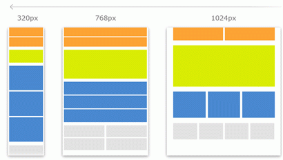
Exploring the Essential Graphic Elements in Web Design In the expansive landscape of web design, graphic elements serve as the visual building blocks that not only captivate but also guide users through an immersive online experience. From images and icons to typography and colors, each element plays a crucial role in shaping the aesthetics and functionality of a website. Let’s delve into the diverse world of graphic elements and uncover their significance in crafting compelling web designs. 1. Images: Painting Pictures with Pixels Images are the backbone of visual storytelling on the web. From stunning photographs to custom illustrations, they breathe life into the digital realm, evoking emotions and conveying messages with unparalleled clarity. Whether it’s product showcases on an e-commerce site or captivating hero banners on a landing page, strategically placed images have the power to engage users and enhance brand identity. 2. Icons: Navigating with Visual Signposts Icons are the silent heroes of web navigation, guiding users seamlessly through interfaces and enhancing user experience with intuitive visual cues. From simple arrow icons indicating directions to complex symbol sets representing actions and functionalities, icons bridge the gap between user intent and digital interaction, making browsing more efficient and enjoyable. 3. Typography: Crafting Words into Art Typography transcends mere text, transforming words into visual expressions that captivate and inform. The choice of fonts, styles, and hierarchies can evoke different emotions, reinforce brand identity, and improve readability. Whether it’s bold headlines that command attention or elegant body text that invites immersion, typography is a powerful tool for shaping the tone and personality of a website. 4. Colors: Painting the Canvas of Emotion Colors wield immense influence in web design, evoking emotions, setting moods, and reinforcing brand identity. From vibrant palettes that exude energy to minimalist schemes that convey sophistication, the strategic use of colors can create unforgettable visual experiences. Understanding color psychology and harmonies is essential for creating cohesive designs that resonate with the target audience and leave a lasting impression. 5. Illustrations: Infusing Personality into Design Illustrations add a touch of whimsy and personality to web design, transforming mundane interfaces into immersive storytelling experiences. Whether it’s hand-drawn sketches or digital artwork, illustrations have the power to convey complex ideas, evoke emotions, and establish a unique brand identity. From playful mascots that engage users to intricate visuals that explain intricate concepts, illustrations breathe life into the digital landscape. 6. Textures and Patterns: Adding Depth and Texture Textures and patterns add depth and dimension to web design, infusing visual interest and tactile sensations into digital interfaces. Whether it’s subtle gradients that create depth or bold patterns that command attention, textures add a layer of richness and complexity to the visual experience. From minimalist designs with clean lines to eclectic compositions with intricate patterns, textures and patterns enhance the overall aesthetic appeal of a website. 7. Whitespace: Embracing the Power of Simplicity Whitespace, often referred to as negative space, is the unsung hero of web design, providing breathing room for content to shine and guiding users through interfaces with clarity and elegance. By strategically leveraging whitespace, designers can improve readability, draw attention to key elements, and create a sense of balance and harmony. From spacious layouts that exude tranquility to minimalist compositions that command attention, whitespace plays a pivotal role in shaping the user experience. 8. Responsive Design: Ensuring Seamless Adaptability In an era of diverse devices and screen sizes, responsive design is paramount for ensuring that graphic elements translate seamlessly across different platforms and resolutions. By embracing fluid layouts, flexible images, and scalable typography, designers can create cohesive experiences that adapt to the unique needs of each user. From mobile-friendly interfaces that prioritize accessibility to desktop layouts that maximize immersion, responsive design ensures that graphic elements shine regardless of the viewing context. In conclusion graphic elements are the soul of web design, infusing digital interfaces with personality, functionality, and visual appeal. By harnessing the power of images, icons, typography, colors, illustrations, textures, whitespace, and responsive design, designers can create immersive experiences that captivate users and elevate brands. With a deep understanding of these essential graphic elements, designers can craft compelling web designs that leave a lasting impression in the ever-evolving digital landscape.

Essential Graphic Elements in Web Design Read More »

Typography and Branding in Web Design

The Power of Typography and Branding in Web Design: Crafting Compelling Online Identities Introduction:In the ever-evolving landscape of web design, where attention spans are fleeting and first impressions are everything, the importance of typography cannot be overstated. Typography serves as the voice of a website, conveying not only information but also emotion, personality, and brand identity. In this comprehensive exploration, we delve into the symbiotic relationship between typography and branding in web design, uncovering the strategies and principles that underpin effective online communication. Understanding Typography:Typography, the art and technique of arranging type, encompasses a myriad of elements, each playing a crucial role in shaping the user experience. From font choice to line spacing, every decision influences how content is perceived and consumed. In the realm of web design, where readability and legibility are paramount, typography serves as the cornerstone of effective communication. Conclusion:Typography is more than just words on a screen; it’s a powerful tool for shaping perceptions, eliciting emotions, and building connections. In the realm of web design, where brands compete for attention in a crowded digital landscape, effective typography can mean the difference between engagement and indifference. By understanding the intricate interplay between typography and branding, designers can craft compelling online identities that resonate with users, reinforce brand values, and leave a lasting impression in the minds of visitors.

Typography and Branding in Web Design Read More »

Text Alignment in Web Design:

Text Alignment in Web Design: A Comprehensive Guide In the realm of web design, text alignment plays a pivotal role in shaping the visual appeal and readability of content. From enhancing user experience to reinforcing brand identity, the way text is aligned can significantly impact how information is perceived and engaged with by visitors. In this comprehensive guide, we delve into the nuances of text alignment, exploring its principles, best practices, and implications for effective web design. Understanding Text Alignment Text alignment refers to the positioning of text within a designated space, such as a webpage or a text block. It encompasses four primary alignment options: Each alignment option carries its own aesthetic and functional implications, influencing the visual hierarchy, readability, and overall user experience of the content. The Role of Text Alignment in Web Design Best Practices for Text Alignment in Web Design Conclusion In the intricate tapestry of web design, text alignment serves as both a functional tool and a creative expression. By understanding the principles and best practices of text alignment, designers can wield this fundamental element to craft visually captivating and user-friendly websites. Whether guiding users’ gaze through a labyrinth of content or infusing a digital space with aesthetic allure, thoughtful text alignment lies at the heart of effective web design, shaping the way we engage with information in the digital age.

Text Alignment in Web Design: Read More »

Line Length in Web Design

The Importance of Line Length in Web Design: Enhancing Readability and User Experience In the realm of web design, where every pixel counts and every element serves a purpose, typography stands as a cornerstone of effective communication. Among the various typographic considerations, line length emerges as a crucial factor that significantly impacts readability and user experience. In this comprehensive exploration, we delve into the significance of line length in web design, its influence on user interaction, and strategies for optimizing line length to enhance readability and engagement. Understanding Line Length Line length, also known as measure, refers to the horizontal span of text from the beginning of one line to the end. It is measured in characters, words, or more commonly, as the number of characters including spaces. While seemingly mundane, line length plays a pivotal role in determining how effortlessly users can consume textual content on the web. The Balancing Act: Readability vs. Scannability The ideal line length strikes a delicate balance between readability and scannability. A line that is too short can disrupt the flow of reading, leading to frequent line breaks and a disjointed experience. Conversely, an excessively long line can overwhelm users, making it challenging to maintain focus and track the progression of text. The Impact on Readability Optimal line length is essential for maximizing readability, ensuring that users can comfortably absorb and comprehend textual content without undue strain. Research suggests that the ideal line length for web content falls within the range of 50 to 75 characters per line, although preferences may vary based on factors such as font size, typeface, and reading environment. Enhancing User Engagement Effective line length goes beyond mere legibility; it influences user engagement and retention. By presenting content in a format that facilitates effortless reading, websites can encourage users to linger longer, explore further, and ultimately, achieve their objectives with greater satisfaction. Whether conveying information, telling a story, or promoting a product, the way text is presented significantly impacts its reception and efficacy. Strategies for Optimizing Line Length Achieving the optimal line length involves a nuanced approach that considers various factors and accommodates diverse user preferences. Here are some strategies for optimizing line length in web design: Conclusion In the intricate tapestry of web design, where every element serves a purpose and contributes to the user experience, line length emerges as a critical determinant of readability, engagement, and overall success. By understanding the nuances of line length and employing strategies to optimize its impact, designers can create web experiences that resonate with users, foster meaningful interactions, and ultimately, achieve their objectives with clarity and effectiveness.

Line Length in Web Design Read More »

Understanding Font Size in Web Design

Understanding Font Size in Web Design: A Comprehensive Guide Typography is a fundamental element of web design, and font size plays a crucial role in determining the readability, accessibility, and aesthetic appeal of text content on websites. In this article, we’ll delve into the intricacies of font size in web design, exploring its importance, best practices, and considerations for creating an optimal user experience. Importance of Font Size in Web Design Font size directly impacts how users perceive and interact with content on a website. It affects readability, legibility, and comprehension, influencing the overall user experience. Here’s why font size is essential in web design: Best Practices for Font Size in Web Design When determining font size for web design, several best practices should be considered to optimize readability and user experience: Conclusion Font size is a critical component of web design that influences readability, accessibility, and user experience. By understanding the importance of font size and following best practices, designers can create visually engaging and user-friendly websites that effectively communicate content to audiences across different devices and platforms. Prioritizing readability, consistency, and accessibility ensures that text content is accessible and comprehensible to all users, enhancing the overall usability and success of the website.

Understanding Font Size in Web Design Read More »

The Art of Font Choice in Web Design

The Art of Font Choice in Web Design: A Comprehensive Guide In the realm of web design, typography stands as one of the cornerstone elements influencing user experience, brand identity, and overall aesthetics. Font choice, in particular, holds immense significance, as it not only affects readability but also communicates the essence of a website’s content and brand personality. In this comprehensive guide, we delve deep into the nuances of font choice for web design, exploring its intricacies and providing actionable insights for designers to create compelling typographic experiences. Understanding Font Families: Fonts are often categorized into different families based on their stylistic attributes. The primary font families used in web design include serif, sans-serif, display, and monospaced. Factors Influencing Font Choice: When selecting fonts for web design, several factors come into play, each contributing to the overall typographic harmony and effectiveness: Best Practices for Font Selection: While the selection of fonts may seem subjective, adhering to best practices can streamline the decision-making process and elevate the typographic quality of web design: Conclusion: In the intricate tapestry of web design, font choice emerges as a pivotal element, weaving together aesthetics, functionality, and brand communication. By understanding the nuances of font families, considering key factors influencing font selection, and adhering to best practices, designers can harness the power of typography to create captivating and user-centric web experiences. As technology evolves and design trends shift, the art of font choice remains timeless—a testament to its enduring impact on the digital landscape.

The Art of Font Choice in Web Design Read More »

Typography for Web Design

Typography plays a fundamental role in web design, influencing how users perceive and interact with digital content. Whether you’re just starting out in web design or you’re an experienced professional, understanding the principles of typography is essential for creating visually appealing, readable, and effective websites. In this comprehensive guide, we’ll explore everything you need to know about typography for web design, from the basics to advanced techniques. 1. Introduction to Typography Typography is the art and technique of arranging type to make written language legible, readable, and visually appealing. In web design, typography encompasses various elements such as font choice, font size, spacing, line length, line spacing, and text alignment. 2. Importance of Typography in Web Design Typography plays a crucial role in shaping the user experience on a website. It helps convey information effectively, establish hierarchy and visual flow, evoke emotions, and reinforce brand identity. Well-executed typography enhances readability and engagement, ultimately improving the overall usability of a website. 3. Basic Principles of Typography 4. Advanced Typography Techniques 5. Responsive Typography With the prevalence of different screen sizes and devices, it’s important to implement responsive typography that adjusts dynamically to accommodate various viewport sizes. Use relative units like percentages, ems, or rems for font sizes and line heights to ensure scalability across different devices. 6. Web Fonts Web fonts allow designers to use custom fonts that may not be available on users’ devices. Services like Google Fonts, Adobe Fonts, and Typekit provide a wide selection of web fonts that can be easily integrated into web designs using CSS. Conclusion Typography is a critical aspect of web design, impacting both the aesthetics and functionality of a website. By mastering the principles of typography and applying them thoughtfully, designers can create engaging, readable, and visually stunning websites that leave a lasting impression on users. Whether you’re a beginner or an expert, understanding typography is essential for creating successful web experiences.

Typography for Web Design Read More »

The Basics of Color Schemes for Web Design

The Basics of Color Schemes for Web Design: Enhancing User Experience Through Visual Harmony In the realm of web design, color plays a pivotal role in shaping user experiences, influencing perceptions, and communicating brand messages effectively. A well-crafted color scheme can captivate visitors, guide them through content, and evoke desired emotions. Understanding the fundamentals of color schemes is essential for web designers to create visually appealing and cohesive websites. In this comprehensive guide, we delve into the basics of color schemes for web design, exploring various concepts, principles, and best practices. Introduction to Color Theory At the core of understanding color schemes lies the foundation of color theory. Color theory is a set of principles and guidelines that elucidate how colors interact with each other and the human eye. By familiarizing oneself with color theory, designers gain insights into creating harmonious and aesthetically pleasing color combinations. Basic Color Theory Color theory encompasses a multitude of definitions, concepts and design applications – enough to fill several encyclopedias. However, there are three basic categories of color theory that are logical and useful : The color wheel, color harmony, and the context of how colors are used. Color theories create a logical structure for color. For example, if we have an assortment of fruits and vegetables, we can organize them by color and place them on a circle that shows the colors in relation to each other. The Color Wheel A color circle, based on red, yellow and blue, is traditional in the field of art. Sir Isaac Newton developed the first circular diagram of colors in 1666. Since then, scientists and artists have studied and designed numerous variations of this concept. Differences of opinion about the validity of one format over another continue to provoke debate. In reality, any color circle or color wheel which presents a logically arranged sequence of pure hues has merit. There are also definitions (or categories) of colors based on the color wheel. We begin with a 3-part color wheel. Primary Colors: Red, yellow and blueIn traditional color theory (used in paint and pigments), primary colors are the 3 pigment colors that cannot be mixed or formed by any combination of other colors. All other colors are derived from these 3 hues.  Secondary Colors: Green, orange and purpleThese are the colors formed by mixing the primary colors. Tertiary Colors: Yellow-orange, red-orange, red-purple, blue-purple, blue-green & yellow-greenThese are the colors formed by mixing a primary and a secondary color. That’s why the hue is a two word name, such as blue-green, red-violet, and yellow-orange.  Color Harmony Harmony can be defined as a pleasing arrangement of parts, whether it be music, poetry, color, or even an ice cream sundae. In visual experiences, harmony is something that is pleasing to the eye. It engages the viewer and it creates an inner sense of order, a balance in the visual experience. When something is not harmonious, it’s either boring or chaotic. At one extreme is a visual experience that is so bland that the viewer is not engaged. The human brain will reject under-stimulating information. At the other extreme is a visual experience that is so overdone, so chaotic that the viewer can’t stand to look at it. The human brain rejects what it cannot organize, what it cannot understand. The visual task requires that we present a logical structure. Color harmony delivers visual interest and a sense of order. In summary, extreme unity leads to under-stimulation, extreme complexity leads to over-stimulation. Harmony is a dynamic equilibrium. Some Formulas for Color Harmony There are many theories for harmony. The following illustrations and descriptions present some basic formulas. 1. A color scheme based on analogous colors Analogous colors are any three colors which are side by side on a 12-part color wheel, such as yellow-green, yellow, and yellow-orange. Usually one of the three colors predominates.  2. A color scheme based on complementary colors Complementary colors are any two colors which are directly opposite each other, such as red and green and red-purple and yellow-green. In the illustration above, there are several variations of yellow-green in the leaves and several variations of red-purple in the orchid. These opposing colors create maximum contrast and maximum stability.  3. A color scheme based on nature Nature provides a perfect departure point for color harmony. In the illustration above, red yellow and green create a harmonious design, regardless of whether this combination fits into a technical formula for color harmony. Components of Color Before delving into color schemes, it’s imperative to grasp the components of color: Types of Color Schemes Understanding the different types of color schemes empowers designers to select the most suitable palette for their web projects. Some common color schemes include: Color Psychology in Web Design Beyond aesthetics, colors possess psychological attributes that can influence user behavior and perception. By harnessing the principles of color psychology, designers can evoke specific emotions and responses from website visitors. For instance: Achieving Color Harmony Harmony is key to a successful color scheme, ensuring that colors complement each other and contribute to a unified visual experience. Designers can achieve harmony through: Accessibility and Color Contrast Accessibility is a critical consideration in web design, and color plays a significant role in ensuring inclusivity for all users. Designers should adhere to accessibility standards, such as the Web Content Accessibility Guidelines (WCAG), to ensure sufficient color contrast for readability. Tools and resources are available to evaluate color combinations and ensure compliance with accessibility guidelines. Cultural and Contextual Considerations Colors can carry different meanings and cultural associations across diverse audiences and contexts. Designers should be mindful of cultural sensitivities and preferences when selecting color schemes, especially for global or multicultural audiences. Conducting research and soliciting feedback from target demographics can help designers make informed color choices. Tools and Resources for Color Selection Numerous tools and resources are available to assist designers in selecting and refining color schemes for web projects. From color palette generators to accessibility checkers, these tools streamline the color

The Basics of Color Schemes for Web Design Read More »

Scroll to Top

Search