
Understanding the Basics of Website Layout
In the vast landscape of the internet, websites serve as digital storefronts, gathering places, and information hubs for users worldwide. At the heart of every successful website lies a well-thought-out layout. The layout determines how information is presented, how users navigate through the content, and ultimately, how effectively the website achieves its goals, whether it’s conveying information, selling products, or fostering engagement.
Creating an effective website layout involves a combination of design principles, user experience considerations, and technical implementation. In this comprehensive guide, we’ll delve into the fundamental aspects of website layout, exploring everything from design principles to practical tips for implementation.
Understanding Website Layout
Website layout refers to the arrangement of visual elements on a web page. It encompasses the structure, organization, and presentation of content to create a cohesive and intuitive user experience. A well-designed layout guides users through the website, directing their attention to key information and encouraging interaction.
Key Components of Website Layout

- Header: The header typically contains the website’s logo, navigation menu, and often contact information or other important links. It serves as a roadmap for users to explore the site’s different sections.
- Navigation Menu: The navigation menu provides links to various pages or sections within the website. It should be clear, concise, and easily accessible, allowing users to navigate seamlessly.
- Content Area: This is where the main content of the website resides. It includes text, images, videos, and other media that convey information to the user. The content area should be well-organized and visually appealing to engage users.
- Sidebar (Optional): Sidebars are commonly used for additional navigation links, advertisements, or supplementary information. However, they can clutter the layout if not used judiciously, so consider their necessity carefully.
- Footer: The footer typically contains copyright information, links to important pages, social media icons, and other relevant details. It provides closure to the page and gives users a final point of navigation.
Principles of Effective Website Layout
Creating a compelling website layout involves applying design principles that enhance usability and visual appeal. Here are some key principles to consider:
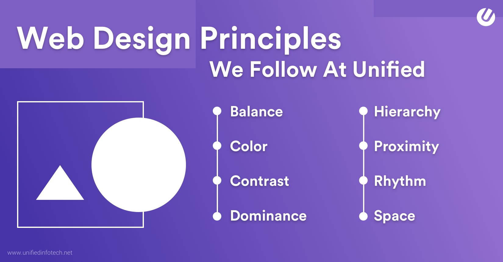
- Balance: A balanced layout distributes visual elements evenly throughout the page, creating a sense of stability and harmony. Balance can be achieved through symmetrical or asymmetrical arrangements, depending on the desired aesthetic.
- Hierarchy: Establishing a clear hierarchy helps users prioritize information and navigate the website more efficiently. Use visual cues such as size, color, and placement to distinguish between different levels of importance.
- Consistency: Consistency in design elements such as typography, color schemes, and navigation helps users feel familiar with the website and reduces cognitive load. Maintain consistency across all pages to establish a cohesive brand identity.
- Whitespace: Also known as negative space, whitespace refers to the empty areas between content elements. Strategic use of whitespace improves readability, highlights important content, and enhances overall visual appeal.
- Alignment: Aligning elements along a common axis creates a sense of order and organization. Whether using left, right, center, or justified alignment, consistency is key to maintaining a polished appearance.
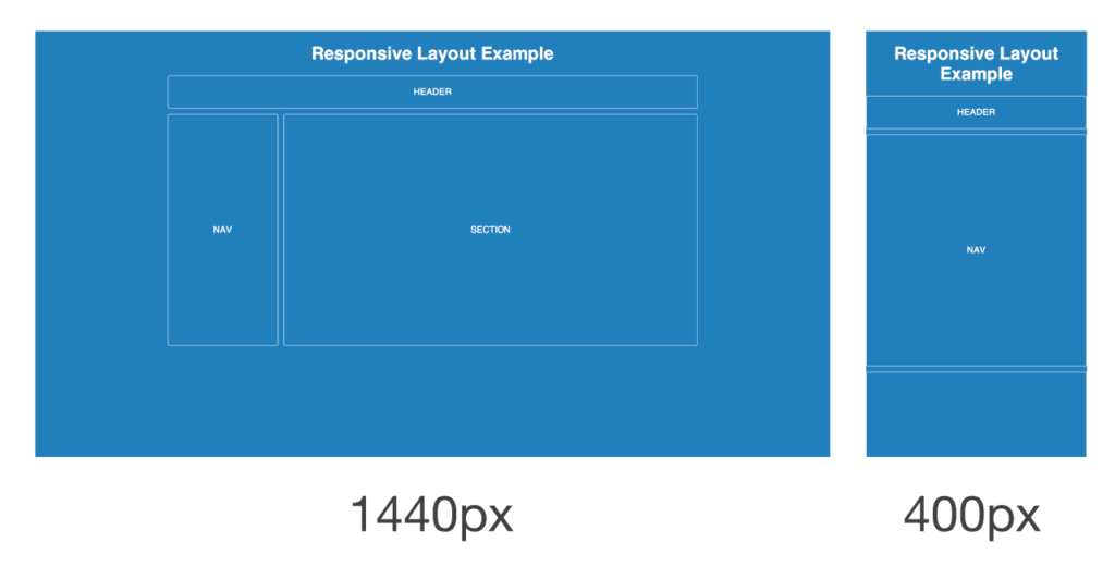
Responsive Design
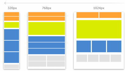
With the increasing prevalence of mobile devices, responsive design has become essential for modern websites. Responsive design ensures that websites adapt seamlessly to different screen sizes and devices, providing a consistent user experience across platforms.
Key principles of responsive design include:
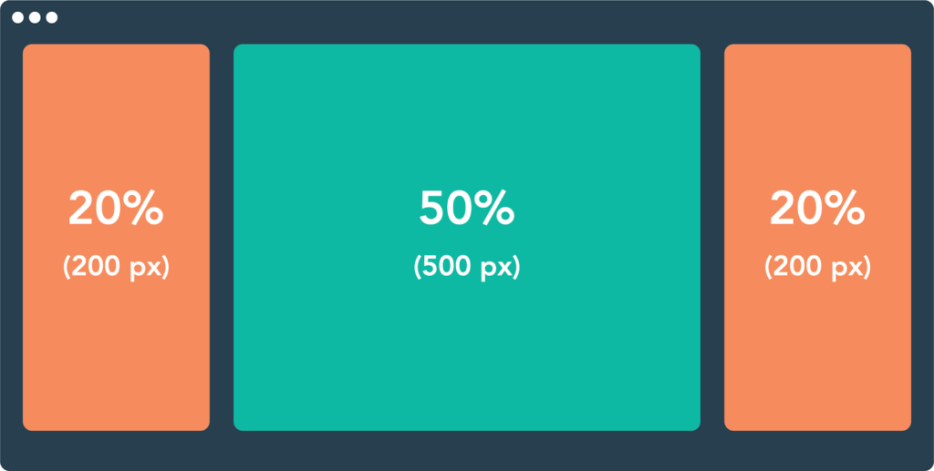
- Fluid Grids: Instead of fixed-width layouts, use fluid grids that adjust proportionally to the user’s screen size. This allows content to resize dynamically, optimizing the layout for various devices.
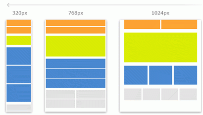
- Flexible Images: Employ techniques such as CSS media queries and relative units to ensure that images scale appropriately on different devices. Avoid using fixed-width images that may overflow or distort on smaller screens.
- Media Queries: Media queries enable you to apply different styles based on the user’s device characteristics, such as screen width, orientation, and resolution. Use media queries to define breakpoints where the layout adjusts to accommodate various screen sizes.
- Mobile-First Approach: Designing for mobile devices first ensures that the website’s core functionality and content are optimized for smaller screens. As screen size increases, you can progressively enhance the layout to take advantage of additional space and features.
Practical Tips for Implementation
When implementing a website layout, consider the following practical tips to streamline the process and improve efficiency:
- Wireframing: Begin by creating wireframes to sketch out the basic structure and layout of each page. Wireframes serve as a blueprint for the design process, allowing you to visualize the placement of elements and identify potential issues early on.
- Prototyping: Use prototyping tools to create interactive mockups that simulate the website’s functionality and navigation. Prototypes help you test different design concepts and gather feedback from stakeholders before proceeding to development.
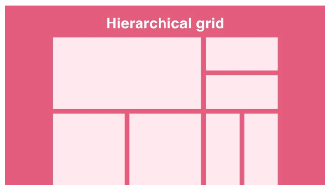
- Grid Systems: Utilize grid systems to establish consistent alignment and spacing between elements. Grid systems provide a framework for organizing content and maintaining visual harmony across the website.
- Browser Compatibility: Test the website layout across different web browsers and devices to ensure compatibility and optimal performance. Address any rendering issues or layout inconsistencies that may arise on specific platforms.
- Accessibility: Design with accessibility in mind by incorporating features such as descriptive alt text for images, keyboard navigation support, and high contrast color schemes. Ensuring accessibility improves usability for all users, including those with disabilities.
Conclusion
A well-designed website layout is essential for creating a positive user experience and achieving the website’s objectives. By understanding the principles of layout design, embracing responsive design techniques, and following best practices for implementation, you can create websites that are intuitive, engaging, and accessible to a diverse audience. Whether you’re building a personal blog, an e-commerce platform, or a corporate website, prioritizing effective layout design will set you on the path to success in the digital realm.