Exploring Grid Layouts: The Backbone of Modern Web Design
In the vast landscape of web design, where creativity meets functionality, the grid layout stands tall as one of the most fundamental and versatile tools in a designer’s arsenal. It serves as the backbone upon which the visual and structural elements of a webpage are organized, offering a framework that is both flexible and powerful. Let’s delve into the depths of grid layouts, understanding their significance, implementation, and the impact they have on shaping the digital experiences of today.
Understanding the Grid: Foundation of Structure
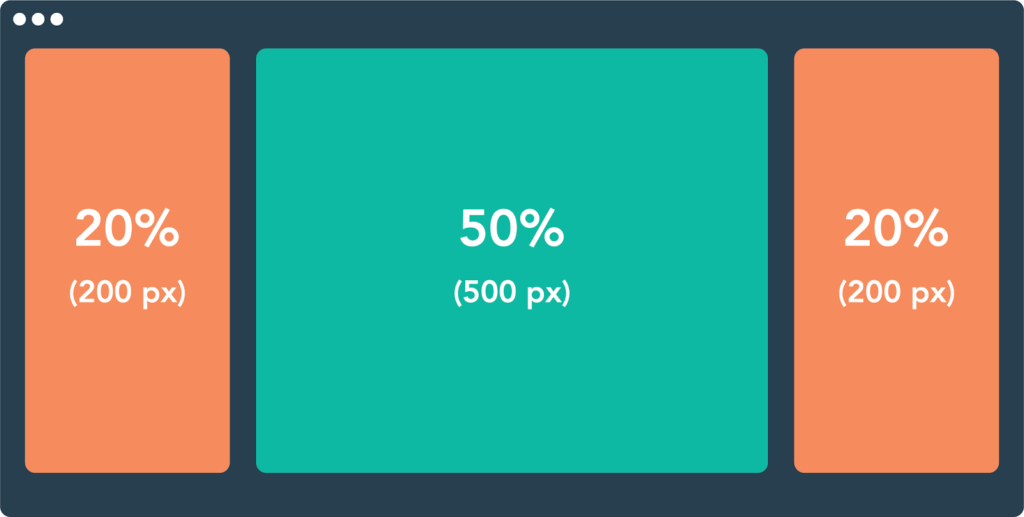
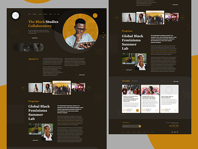
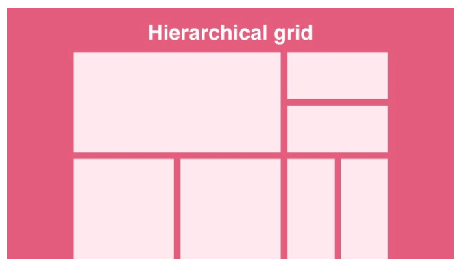
At its core, the grid layout is a system of intersecting horizontal and vertical lines that divide a webpage into various sections or modules. These modules act as containers for different types of content, such as text, images, videos, and interactive elements. By establishing a visual hierarchy and spatial relationships between these elements, the grid provides structure and coherence to the overall design.
Benefits of Grid Layouts: Order Amidst Chaos
The benefits of grid layouts are manifold, offering designers a multitude of advantages in crafting visually appealing and user-friendly websites:
- Consistency: Grid layouts promote consistency in design by establishing uniform spacing, alignment, and proportions across different elements. This consistency enhances readability and comprehension, making it easier for users to navigate and interact with the content.
- Flexibility: Despite providing a structured framework, grid layouts are inherently flexible, allowing designers to adapt and customize them to suit the unique requirements of each project. Whether it’s a simple grid for a blog or a complex multi-column layout for an e-commerce site, the flexibility of grids enables designers to accommodate diverse content types and design preferences.
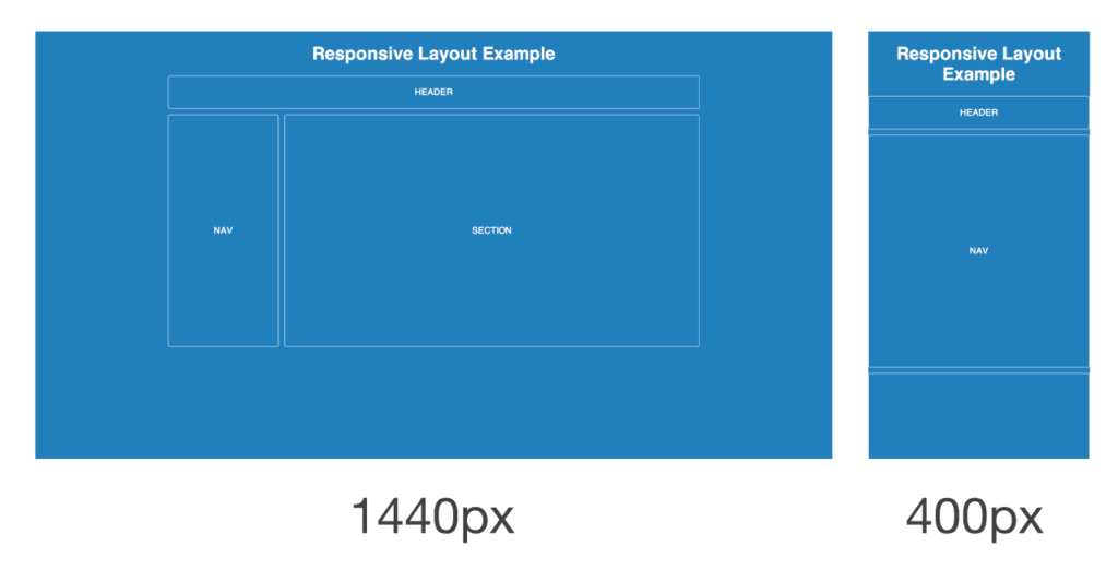
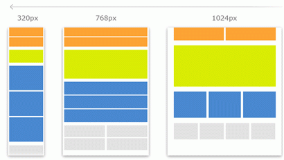
- Responsive Design: In an era where users access websites from a myriad of devices with varying screen sizes and resolutions, responsive design has become paramount. Grid layouts play a crucial role in responsive design, enabling websites to adapt seamlessly to different viewport sizes while maintaining visual integrity and usability.
- Efficiency: By dividing the design process into manageable modules, grid layouts streamline the workflow for designers and developers. With predefined grid systems and frameworks readily available, designers can focus more on creativity and less on the intricacies of layout design, resulting in faster development cycles and smoother collaboration.
Implementing Grid Layouts: Techniques and Tools
Implementing grid layouts involves a combination of design principles, CSS (Cascading Style Sheets), and sometimes JavaScript. Here are some common techniques and tools used in grid layout implementation:
- CSS Grid: Introduced in CSS3, CSS Grid is a powerful layout system that allows designers to create two-dimensional grid layouts with precise control over rows, columns, and grid gaps. With features such as grid-template-rows, grid-template-columns, and grid-area, CSS Grid offers unparalleled flexibility and expressiveness in layout design.
- Flexbox: While CSS Grid excels at creating complex grid layouts, Flexbox is ideal for one-dimensional layouts, such as rows or columns. Flexbox provides a more straightforward approach to layout design, especially for aligning and distributing items within a container along a single axis.
- Grid Frameworks: Grid frameworks like Bootstrap, Foundation, and MaterializeCSS offer pre-designed grid systems and components that can be easily integrated into web projects. These frameworks provide a solid foundation for building responsive and visually appealing websites while saving time and effort in the design process.
- Responsive Design Principles: When implementing grid layouts, it’s essential to adhere to responsive design principles to ensure optimal viewing experiences across various devices. This involves using media queries, fluid layouts, and breakpoints to adapt the layout and content based on viewport size and orientation.
The Future of Grid Layouts: Evolving Trends and Innovations
As web technologies continue to evolve, so do the trends and innovations in grid layout design. Some emerging trends shaping the future of grid layouts include:
- CSS Grid Layout Module Level 2: Building upon the foundation of CSS Grid Level 1, the Level 2 specification introduces new features and enhancements, such as subgrid support, nested grids, and improved accessibility features. These advancements further empower designers to create sophisticated and responsive grid layouts with greater ease and precision.
- Dynamic Grid Systems: With the rise of dynamic content and personalized experiences, there is a growing demand for grid layouts that can adapt and evolve in real-time based on user interactions and preferences. Dynamic grid systems leverage technologies like JavaScript and server-side rendering to create interactive and customizable layouts that respond to user input and behavior.
- Experimental Layouts: As designers push the boundaries of creativity, we’re witnessing an emergence of experimental grid layouts that defy traditional conventions and challenge our perceptions of web design. From asymmetrical grids to non-linear arrangements, these experimental layouts explore new possibilities in visual storytelling and user engagement.
In conclusion, grid layouts represent more than just a design technique; they embody the principles of order, structure, and adaptability that are essential in crafting compelling digital experiences. By understanding the significance of grid layouts, mastering their implementation techniques, and embracing emerging trends, designers can unleash the full potential of this versatile tool and pave the way for the future of web design.