Understanding Liquid or Fluid Layouts in Web Design
In the dynamic realm of web design, where the landscape of devices varies from towering desktop monitors to pocket-sized smartphones, the need for adaptive layouts has never been more critical. Liquid or fluid layouts emerge as a solution, offering flexibility and responsiveness to accommodate the diverse array of screen sizes and resolutions encountered in today’s digital ecosystem.
What are Liquid or Fluid Layouts?
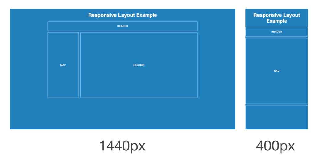
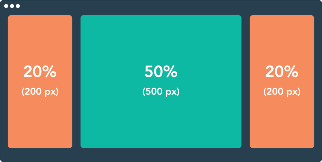
A liquid or fluid layout is a web design approach where elements on a webpage are sized using relative units such as percentages rather than fixed pixel values. Unlike fixed layouts that maintain a constant width, liquid layouts expand and contract dynamically based on the available space, making them inherently adaptable to different screen sizes and orientations.
The Anatomy of Liquid Layouts
Relative Units:
In a fluid layout, dimensions are specified using relative units such as percentages, em units, or viewport units. These units allow elements to scale proportionally based on the size of their parent container or the viewport, ensuring a consistent user experience across various devices.
Flexible Grids:
Central to fluid layouts is the concept of flexible grids, which establish the framework for organizing content. By defining column widths and gutters as percentages rather than fixed pixels, designers create a grid system that can fluidly adjust to different screen widths while maintaining alignment and visual harmony.
Content Adaptation:
In liquid layouts, content flows and adapts dynamically to fit the available space. Text reflows, images scale, and interface elements rearrange themselves to optimize readability and usability across devices. This fluidity enhances the user experience by eliminating the need for horizontal scrolling or zooming on smaller screens.
Advantages of Liquid Layouts
Responsive Design:
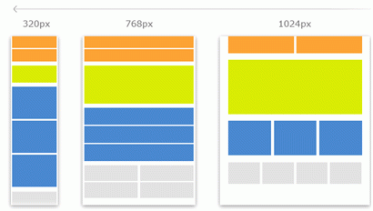
Liquid layouts form the foundation of responsive web design, enabling websites to seamlessly adapt to the ever-expanding array of devices and screen sizes. By embracing fluidity, designers can create interfaces that look and function flawlessly across desktops, laptops, tablets, and smartphones, enhancing accessibility and user satisfaction.
Future-Proofing:
In an era where new devices with varying screen dimensions constantly emerge, fluid layouts offer a future-proof solution. By decoupling design from specific pixel dimensions, websites built on liquid layouts are better equipped to withstand technological advancements and evolving user preferences without requiring frequent redesigns or overhauls.
Improved Accessibility:
Fluid layouts promote accessibility by accommodating users with diverse needs and preferences. Whether individuals access the web via a large desktop monitor, a mid-sized tablet, or a small smartphone screen, liquid layouts ensure that content remains legible and navigable, fostering inclusivity and usability for all.
Challenges and Considerations
Design Control:
While fluid layouts offer adaptability, they can pose challenges in maintaining precise control over the visual presentation of elements. Designers must strike a balance between flexibility and aesthetics, leveraging CSS techniques such as media queries and breakpoints to manage layout adjustments across different screen sizes effectively.
Content Prioritization:
In fluid layouts, content reflows dynamically based on available space, necessitating careful consideration of content hierarchy and prioritization. Designers must ensure that essential information remains prominently displayed across all viewports, avoiding visual clutter or information overload on smaller screens.
Testing and Optimization:
Creating fluid layouts requires thorough testing across a spectrum of devices and screen resolutions to ensure consistent performance and usability. Designers must invest time in iterative testing and optimization, refining layout strategies to deliver optimal experiences across the diverse landscape of digital platforms.
Conclusion
In the ever-evolving landscape of web design, where the only constant is change, liquid or fluid layouts emerge as a versatile and adaptive solution. By embracing fluidity, designers empower websites to transcend the constraints of device-specific dimensions, delivering seamless experiences that resonate with users across a multitude of screens. As the digital ecosystem continues to evolve, the principles of liquid layouts remain indispensable, providing a foundation for responsive design that prioritizes accessibility, usability, and user-centric innovation.