Exploring Multi-column Layouts in Web Design
In the ever-evolving landscape of web design, the arrangement of content on a webpage plays a pivotal role in shaping user experience. Among the array of layout options available to designers, the multi-column layout stands out as a versatile and effective choice. By dividing content into multiple columns, this layout style offers a balance between aesthetics and functionality, enabling designers to optimize space usage and enhance readability. Let’s delve deeper into the intricacies of multi-column layouts and explore their significance in modern web design.
Understanding Multi-column Layouts
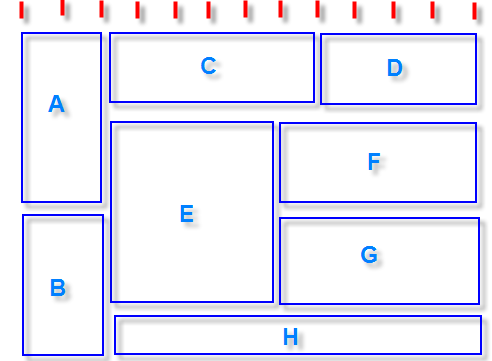
At its core, a multi-column layout involves organizing content into two or more vertical columns within a webpage. Unlike single-column layouts that present content linearly, multi-column designs offer a structured grid system that accommodates diverse content types while maintaining visual coherence. By distributing content across multiple columns, designers can make efficient use of available screen space, especially on larger displays.
Advantages of Multi-column Layouts
- Improved Readability: Breaking content into smaller chunks across multiple columns can enhance readability by reducing line lengths and preventing text from stretching across the entire width of the screen. This facilitates smoother eye movement and reduces cognitive strain for users.
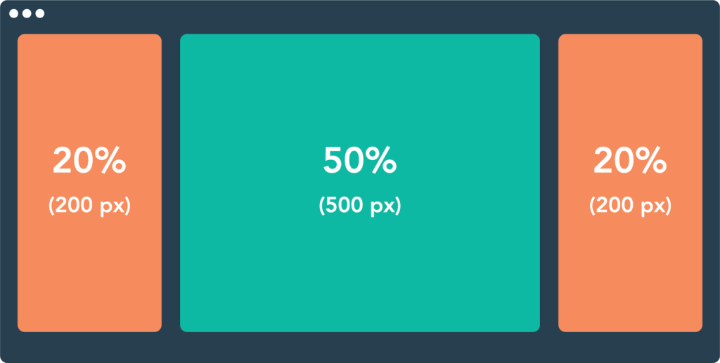
- Optimized Space Usage: Multi-column layouts enable designers to utilize screen real estate more effectively, particularly on widescreen monitors. By spreading content horizontally, this layout style minimizes unused white space and creates a visually balanced composition.
- Enhanced Visual Hierarchy: With the ability to place different types of content in separate columns, designers can establish a clear visual hierarchy that guides users through the webpage. Important information can be prioritized in the primary column, while secondary content or supplementary elements occupy secondary columns.
- Flexible Content Presentation: Multi-column layouts offer flexibility in presenting diverse content formats, including text, images, videos, and interactive widgets. Designers can experiment with column widths and arrangements to create engaging and dynamic interfaces that cater to varying user preferences.
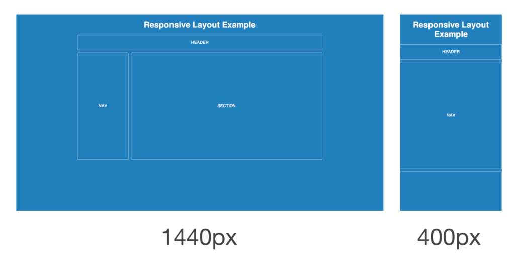
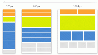
- Responsive Design Compatibility: While multi-column layouts traditionally rely on fixed column widths, advancements in responsive design techniques have made it possible to create fluid multi-column layouts that adapt seamlessly to different screen sizes and orientations. This ensures a consistent user experience across devices, from desktops to smartphones.
Best Practices for Implementing Multi-column Layouts
To harness the full potential of multi-column layouts, designers should adhere to certain best practices:
- Consistent Column Widths: Maintain consistent column widths throughout the layout to establish visual harmony and avoid distractions caused by irregular alignments.
- Whitespace Management: Pay attention to the spacing between columns and elements to prevent overcrowding and maintain visual clarity. Strategic use of whitespace enhances readability and visual appeal.
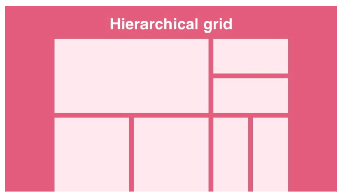
- Grid-based Design: Employ a grid-based approach to structure the layout, ensuring that content aligns neatly within columns and maintains a cohesive overall design.
- Content Prioritization: Prioritize important content in the primary column while relegating secondary content to supplementary columns. This helps users focus on key information without feeling overwhelmed.
- Responsive Considerations: Implement responsive design techniques such as media queries and flexible grid systems to ensure that multi-column layouts adapt gracefully to various screen sizes and resolutions.
Examples of Effective Multi-column Layouts
- News Websites: Many news websites utilize multi-column layouts to present articles, headlines, and multimedia content in a structured format that facilitates browsing and exploration.
- Online Magazines: Digital magazines often employ multi-column layouts to showcase feature articles, images, and advertisements in an engaging and visually appealing manner.
- Product Catalogs: E-commerce platforms leverage multi-column layouts to showcase product listings, descriptions, and related information, enabling users to compare and explore products efficiently.
- Portfolio Websites: Design portfolios and creative showcases often adopt multi-column layouts to present projects, artworks, and testimonials in a visually compelling and organized manner.
Conclusion
In conclusion, multi-column layouts represent a powerful tool in the arsenal of web designers, offering a versatile and effective solution for organizing content and enhancing user experience. By leveraging the advantages of multi-column layouts, designers can create visually appealing, user-friendly interfaces that captivate audiences and deliver information with clarity and efficiency. Whether designing news websites, e-commerce platforms, or personal portfolios, the thoughtful implementation of multi-column layouts can elevate the quality and effectiveness of web design in the digital age.