Unleashing Creativity: The Art of Asymmetrical Layouts in Web Design
In the vast realm of web design, where creativity knows no bounds, the concept of asymmetrical layouts emerges as a bold and captivating design choice. Breaking away from the traditional constraints of symmetrical balance, asymmetrical layouts offer designers a canvas to unleash their imagination, creating visually dynamic and engaging web experiences. In this exploration, we delve deep into the world of asymmetrical layouts, uncovering their principles, benefits, challenges, and best practices in contemporary web design.
Understanding Asymmetrical Layouts
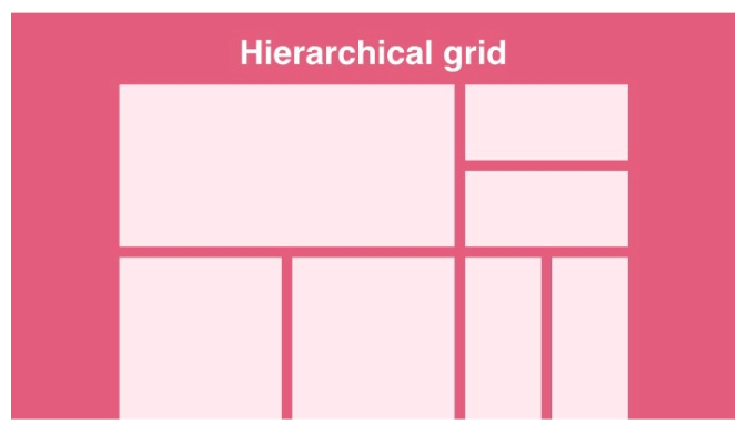
At its core, asymmetrical layout challenges the conventional notion of balance by embracing irregular arrangements of elements. Unlike symmetrical layouts, where content is evenly distributed around a central axis, asymmetrical designs introduce an intentional imbalance, often leveraging varying sizes, shapes, colors, and textures to create visual interest and hierarchy. This deliberate departure from equilibrium imbues web pages with a sense of movement, depth, and personality, captivating users and inviting them on a captivating journey through the digital landscape.
The Artistry of Asymmetry
The allure of asymmetrical layouts lies in their ability to convey emotion, evoke curiosity, and spark intrigue. By defying expectations and introducing asymmetry, designers can inject vitality and uniqueness into their designs, effectively communicating brand identity and storytelling. Through judicious use of negative space, asymmetrical layouts guide the user’s eye, highlighting key content and fostering a seamless flow of information. Moreover, asymmetry fosters a sense of dynamism and spontaneity, inviting users to explore and interact with the interface in an organic and immersive manner.
Benefits of Asymmetrical Layouts
Embracing asymmetry in web design offers a plethora of benefits, both aesthetic and functional. Firstly, asymmetrical layouts allow for greater creative freedom, enabling designers to craft distinctive and memorable web experiences that stand out in a crowded digital landscape. By breaking away from rigid grid structures, asymmetry promotes innovation and experimentation, paving the way for bold and unconventional design solutions.
Furthermore, asymmetrical layouts can enhance visual hierarchy and user engagement. By strategically positioning elements asymmetrically, designers can draw attention to focal points, guide users through the content hierarchy, and encourage interaction. This dynamic approach to layout design not only captivates users but also fosters a sense of exploration and discovery, keeping them engaged and immersed in the digital experience.
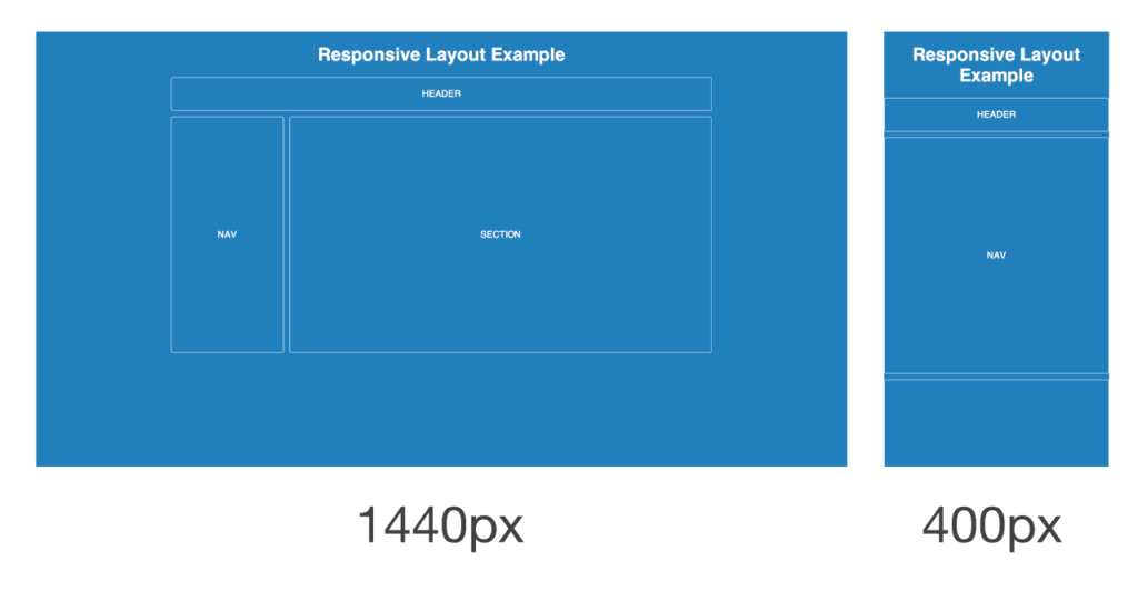
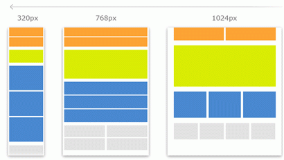
Moreover, asymmetrical layouts offer responsiveness and adaptability across various devices and screen sizes. Unlike fixed-width layouts that may struggle to accommodate different screen resolutions, asymmetrical designs gracefully adjust and reflow to ensure optimal viewing experiences on desktops, tablets, and smartphones. This versatility makes asymmetry a compelling choice for modern, mobile-first web design, catering to the diverse needs of today’s users.
Challenges and Considerations
While asymmetrical layouts offer boundless creative potential, they also present unique challenges and considerations for designers. Achieving visual balance amidst asymmetry requires careful attention to detail, as seemingly minor adjustments can significantly impact the overall composition. Designers must strike a delicate equilibrium between asymmetry and coherence, ensuring that the layout remains visually harmonious and intuitive to navigate.
Moreover, asymmetrical layouts may pose accessibility concerns for users with disabilities, as irregular arrangements of content can disrupt readability and navigation. To mitigate these challenges, designers should prioritize accessibility standards and conduct thorough testing to ensure that the design remains inclusive and user-friendly for all individuals.
Best Practices for Asymmetrical Design
To harness the power of asymmetry effectively, designers should adhere to several best practices:
- Maintain Visual Hierarchy: Use asymmetry to emphasize key elements and establish a clear hierarchy of information, guiding users through the content flow.
- Balance and Harmony: Strive for visual balance by distributing visual weight evenly throughout the layout, avoiding overcrowding or excessive empty space.
- Consistency Across Devices: Ensure that the asymmetrical layout maintains its integrity and legibility across various devices and screen sizes, employing responsive design principles.
- Whitespace Utilization: Leverage negative space to create breathing room between elements, enhancing readability and visual clarity.
- User Testing and Feedback: Solicit user feedback and conduct usability testing to identify any usability issues or accessibility barriers, iterating on the design to optimize user experience.
Conclusion
In the ever-evolving landscape of web design, asymmetrical layouts stand as a testament to the boundless creativity and innovation of designers. By embracing imbalance and asymmetry, designers can craft compelling and immersive web experiences that captivate users and foster meaningful interactions. Asymmetrical layouts offer a gateway to artistic expression and storytelling, enabling designers to push the boundaries of conventional design and redefine the digital landscape. With careful consideration, creativity, and a keen eye for balance, asymmetrical layouts hold the power to transform ordinary websites into extraordinary works of art.


